
PMC Group Brand Identity Logo Design
Three letters. One bold visual system. An identity that turns the name itself into a recognisable graphic asset.

- Sector
- Business services
- Studio
- Bennie Design Studio
- Presentation
- Original portfolio artwork
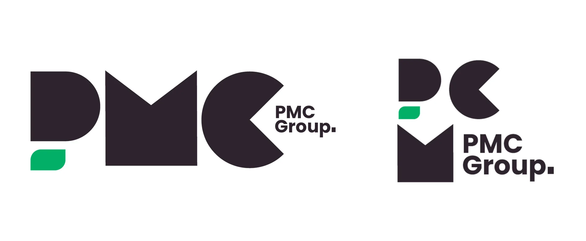
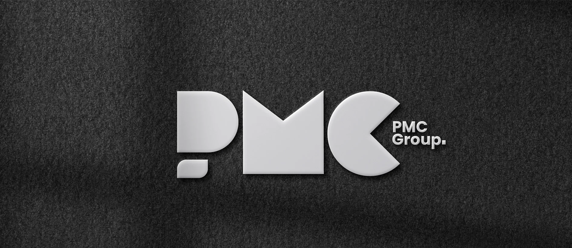
The PMC Group presentation explores a geometric letter-based logo and its applications. The work includes horizontal and stacked arrangements, monochrome treatments, a green accent, signage, stationery and a billboard mockup. Rather than relying on a separate decorative symbol, the initials do the visual work.
Original project on BehanceSource: the accessible Behance artwork by Benjamin Olofinyo / Bennie. Original image compositions are preserved. Individual project descriptions and additional production credits were not accessible from the blocked project pages.
The letters become the identity.
Rounded and angular shapes combine to form the PMC initials. The contrast between those shapes makes the mark distinctive even in one colour. A small green element introduces an accent without competing with the letterforms, while the supporting name anchors the more abstract geometry.

A mark that holds its own in space.
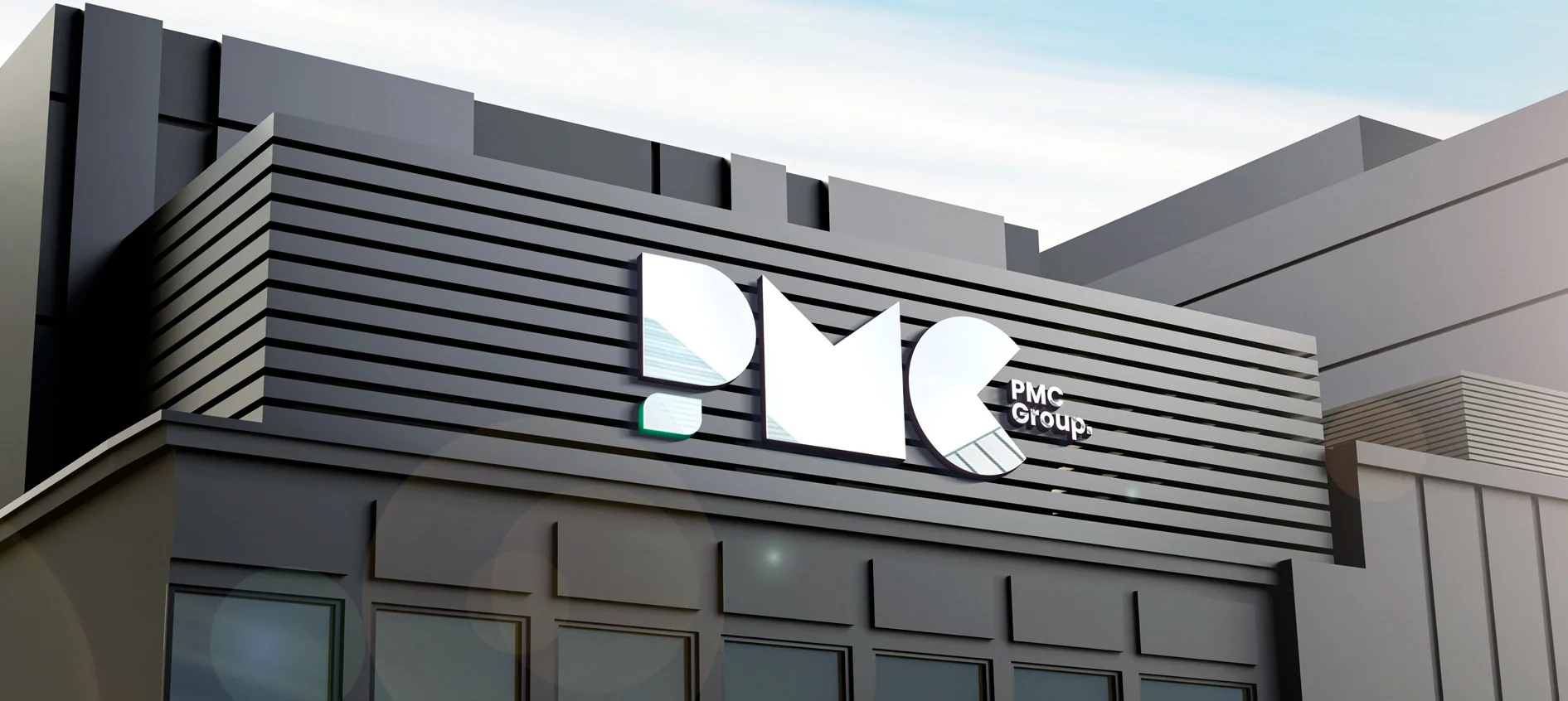
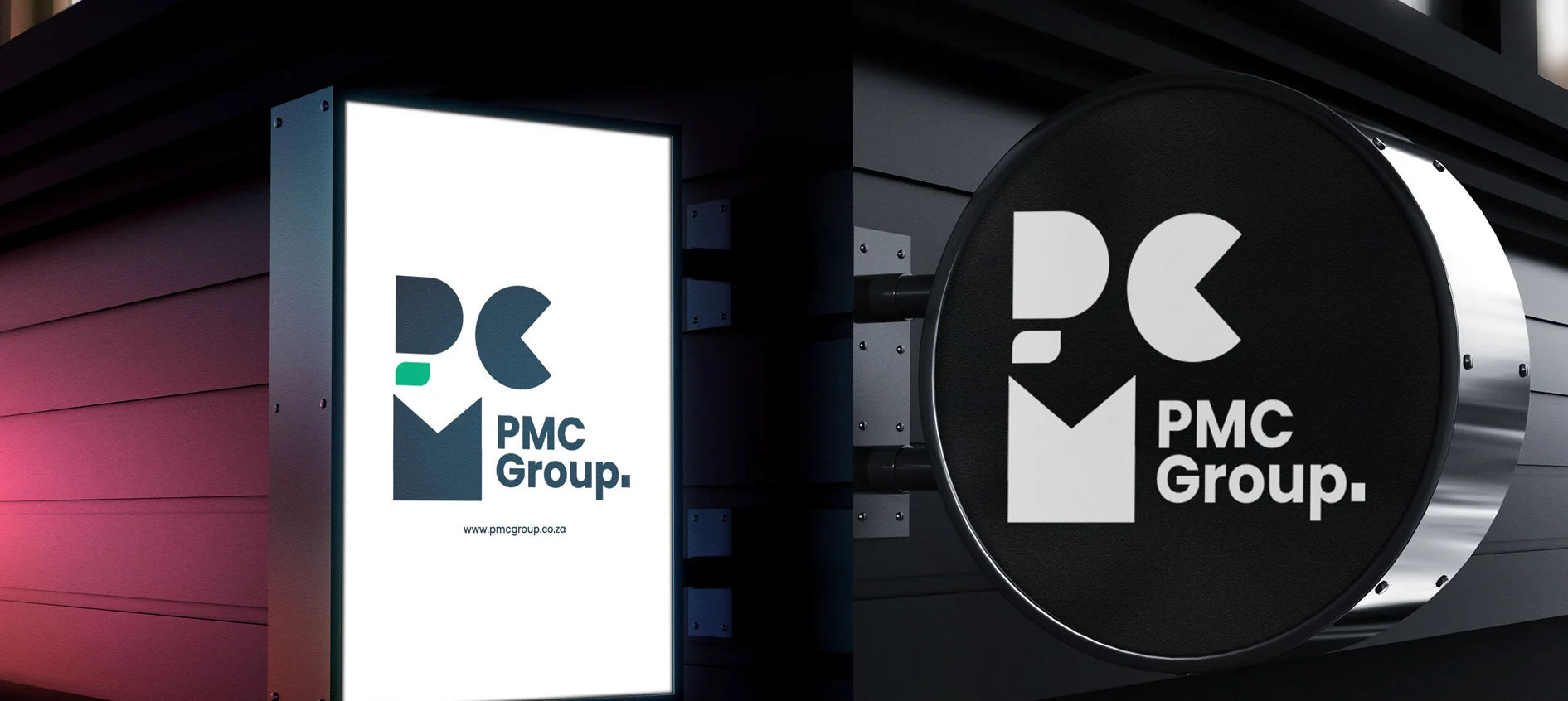
The facade and projecting-sign mockups show how the letterforms function at architectural scale. Their simple silhouettes remain readable against different surfaces. The presentation tests both the full name and a more compact version, giving the identity useful flexibility.
Repetition becomes a graphic language.
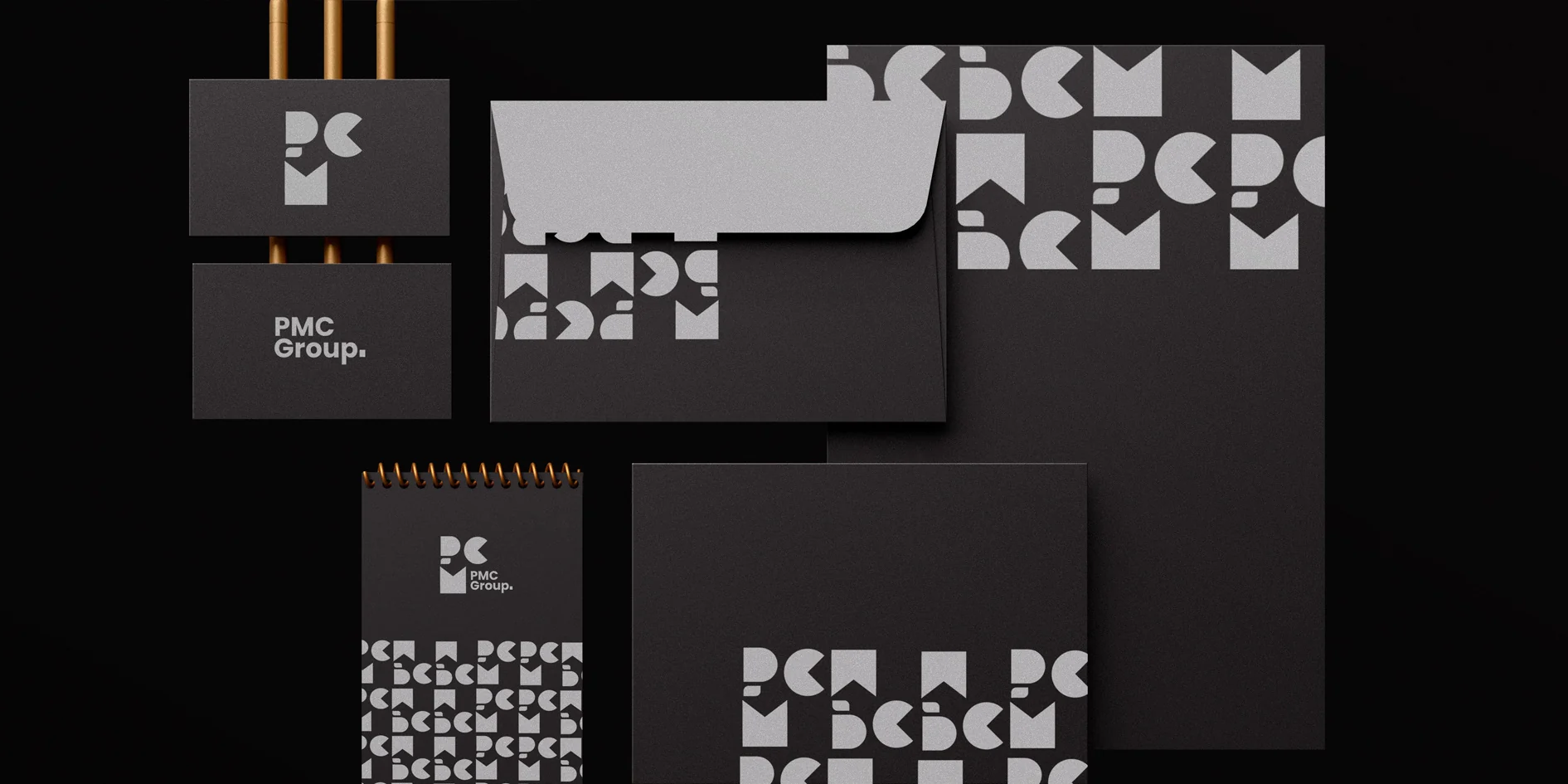
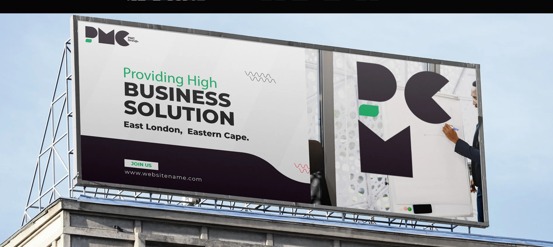
In the stationery suite, fragments and repeats of the logo create a secondary pattern. This gives the materials a shared identity even where the complete mark is not the dominant element. The billboard brings the same shapes into a larger promotional composition.
The pieces, connected.
A flexible letter-based identity demonstrated in logo variations, dimensional treatments, signage, a coordinated stationery suite and an outdoor mockup. No commercial outcome data was supplied.
Another perspective.
 View project
BeetFresh
Plant-Based Food & Beverage
 View project
DMA Kiddies
Children’s retail & family experiences