
DMA Kiddies
Little worlds. One recognisable brand.

- Client
- DMA Kiddies Smart Empire
- Sector
- Children’s retail & family experiences
- Studio
- Bennie Design Studio
- Scope
- Brand identity, logo design, colour system, typography, custom icons, patterns, brand guidelines and website design
- Creative direction
- Olofinyo Temitope Ben, Bennie Design Studio
- Presentation
- Identity & application concepts
DMA Kiddies Smart Empire is building a children’s brand that brings together shopping, play and family connection. Bennie Design Studio developed a visual identity that gives these ambitions a shared personality—joyful, welcoming and recognisable.
Application visuals are concepts exploring the brand’s future possibilities, not photographs of existing DMA Kiddies products or premises.
The challenge
DMA Kiddies needed an identity that could represent a broad and growing offering: children’s clothing, toys, accessories and gifts, alongside plans for playgrounds, activities, birthday parties and family experiences.
The challenge was to bring everything together without making the brand feel scattered. It needed to appeal to children while giving parents a sense of care and confidence. It also needed room to grow as new products and experiences became part of the business.
The idea: a connected world of childhood
We organised the identity around three parts of the brand:
Shop: Little favourites, chosen with care. Play: Room to explore, create and celebrate. Community: A place for families to connect.
“Little worlds. Big possibilities.” became the central expression of that vision. It captures the everyday things that matter to children and the wider world of discovery those things can open.
A playful mark with a practical purpose
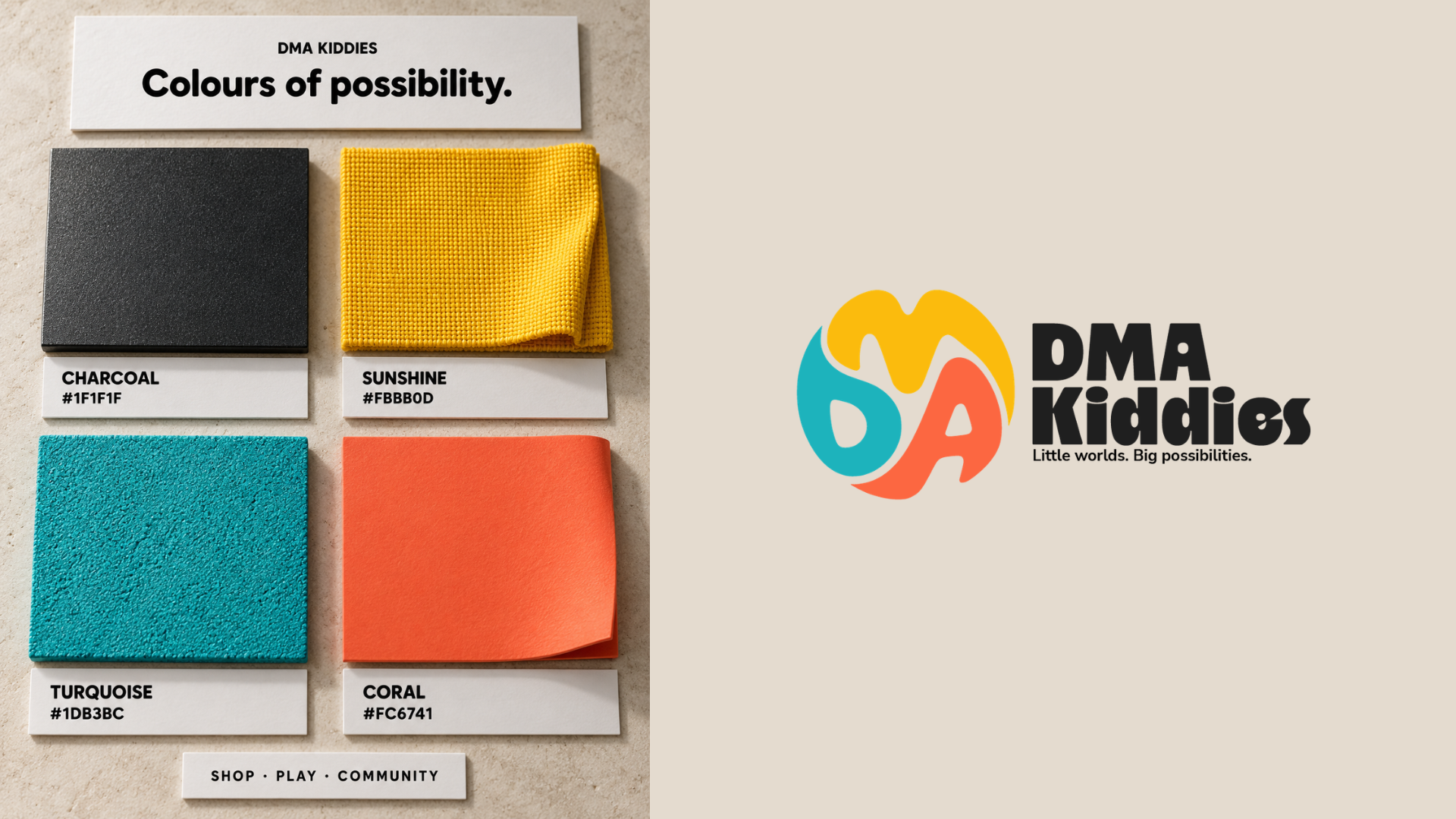
The logo brings the letters D, M and A together into a rounded symbol. Its compact form suggests movement and play, while the individual colours help each letter remain distinct.
The symbol works independently as a brand mark for social profiles, labels and small applications. Paired with the bold wordmark, it creates a fuller signature for packaging, signage and the website.
We developed horizontal, stacked and single-colour variations to give the identity flexibility across different spaces and materials.
Colour with character
The palette combines sunshine yellow, turquoise and coral with a charcoal foundation.
Yellow brings brightness and energy. Turquoise adds freshness, while coral introduces warmth. Charcoal gives the system contrast and keeps information readable.
Across applications, we paid particular attention to logo visibility. White panels provide a clear setting for the full-colour mark, ensuring every letter remains visible—even when the surrounding material uses one of the brand colours.
Typography that balances play and clarity
We paired Please Variable with Nunito Sans to give the brand both personality and readability.
Please Variable brings an expressive voice to key messages. Nunito Sans supports longer copy, navigation and practical information, helping the brand communicate clearly with parents and families.
Together, they allow DMA Kiddies to feel playful while remaining easy to understand.
A visual language beyond the logo
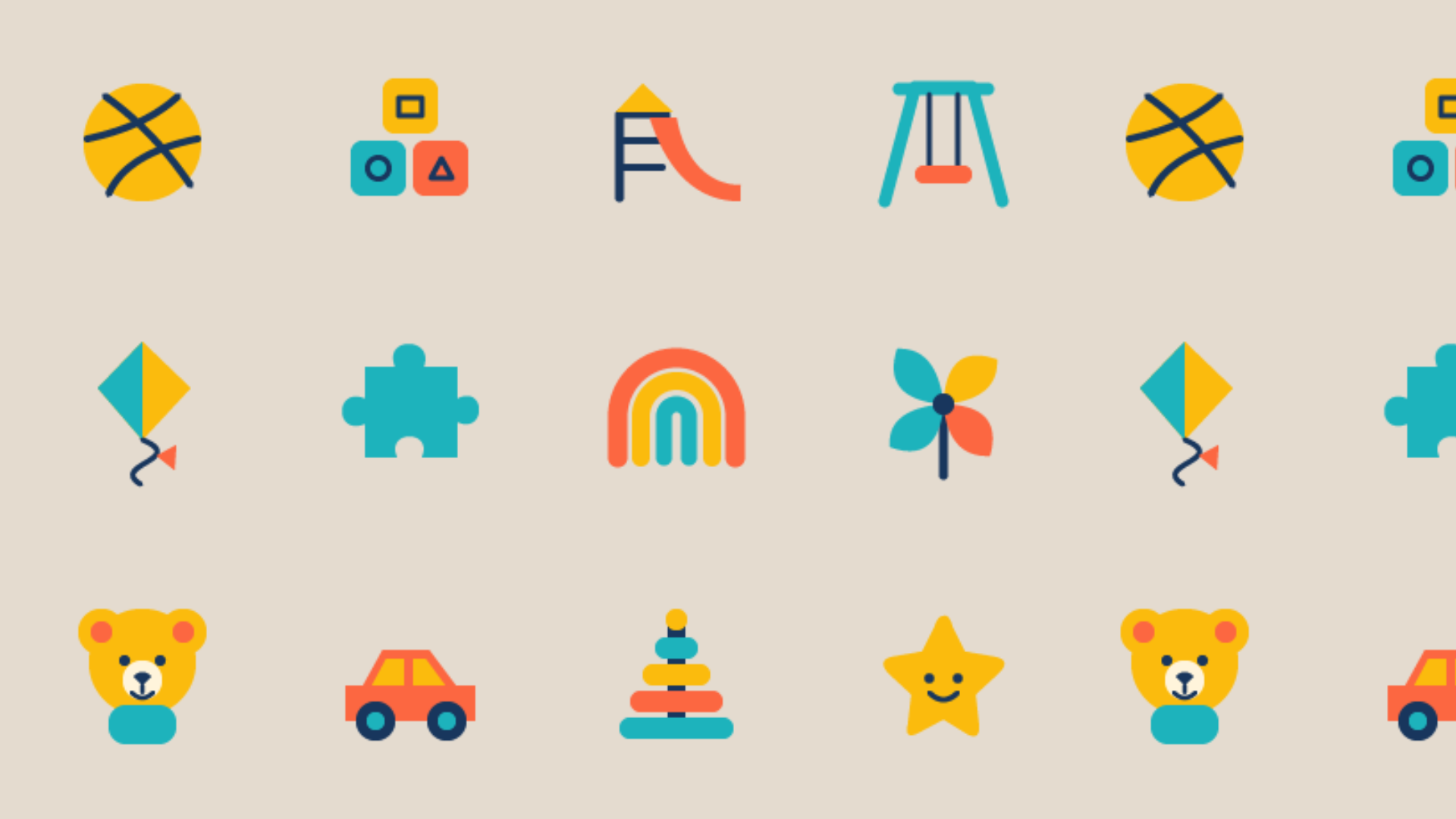
We created a family of icons inspired by childhood: toys, building blocks, kites, rainbows, playground equipment and other familiar objects.
These elements give DMA Kiddies more ways to express its personality. Used individually, they add small moments of recognition. Combined into patterns, they bring character to packaging, clothing, bags and play environments.
The shapes and colours connect each application back to the same identity.
Bringing the identity into everyday life
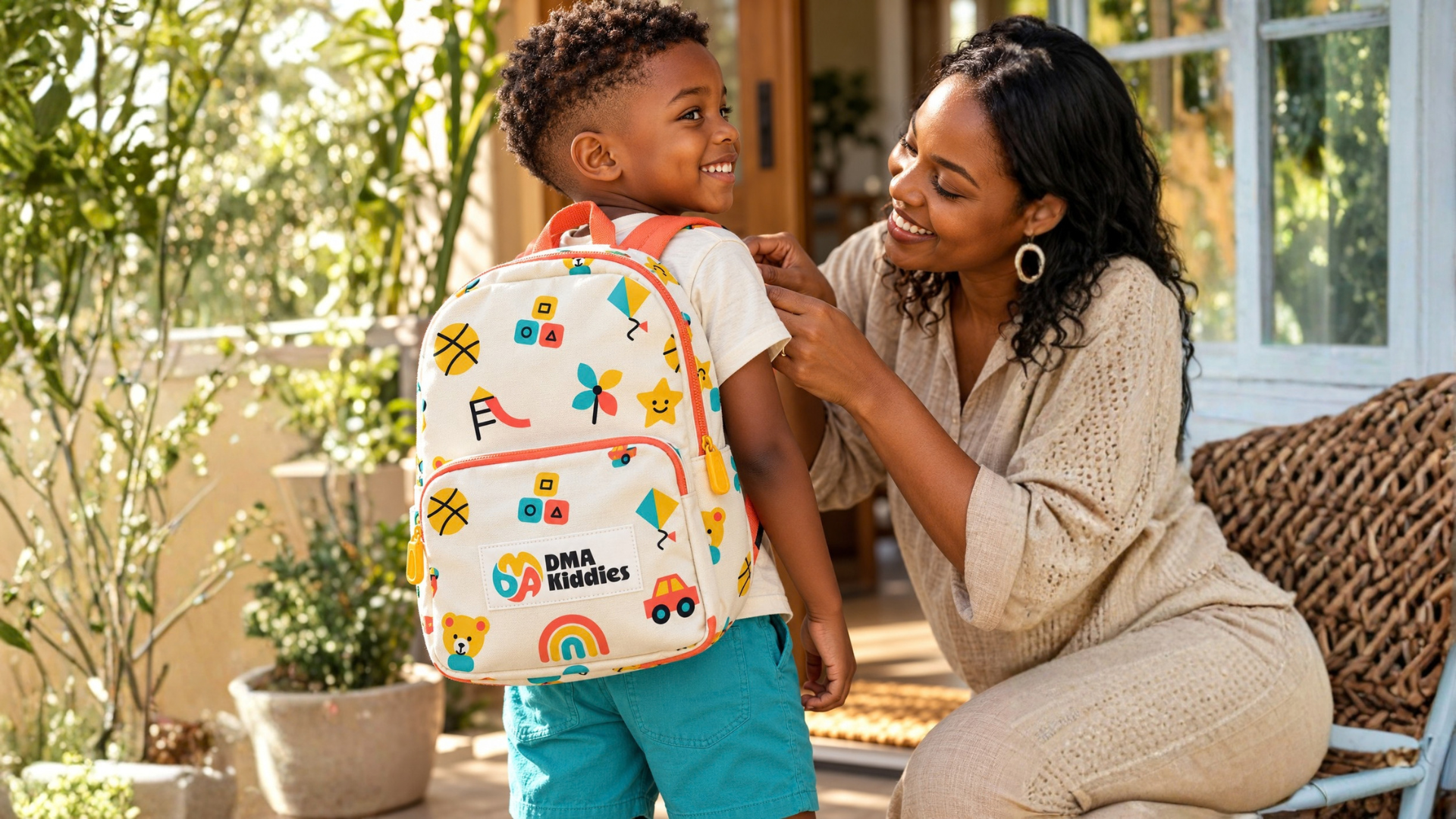
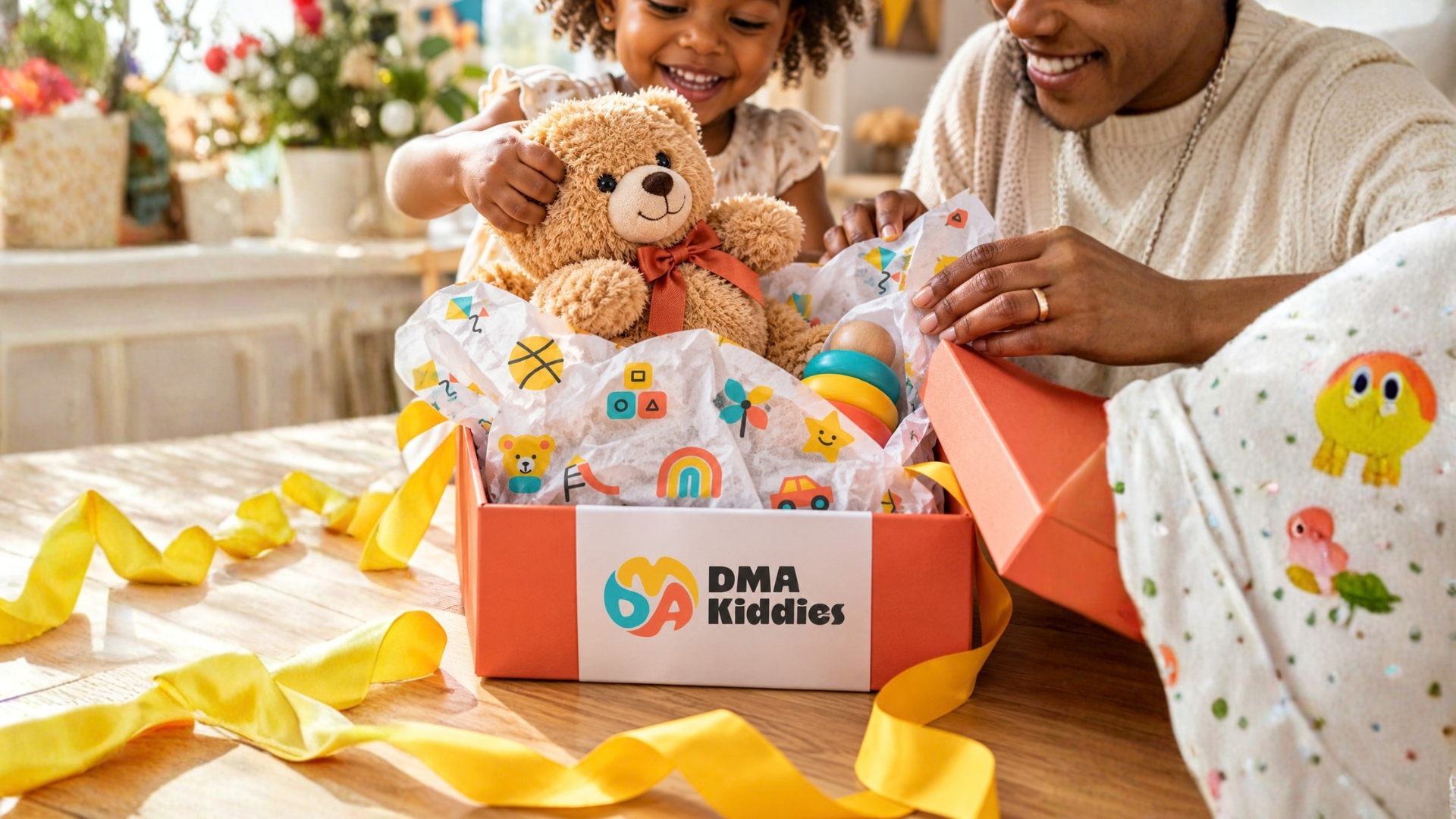
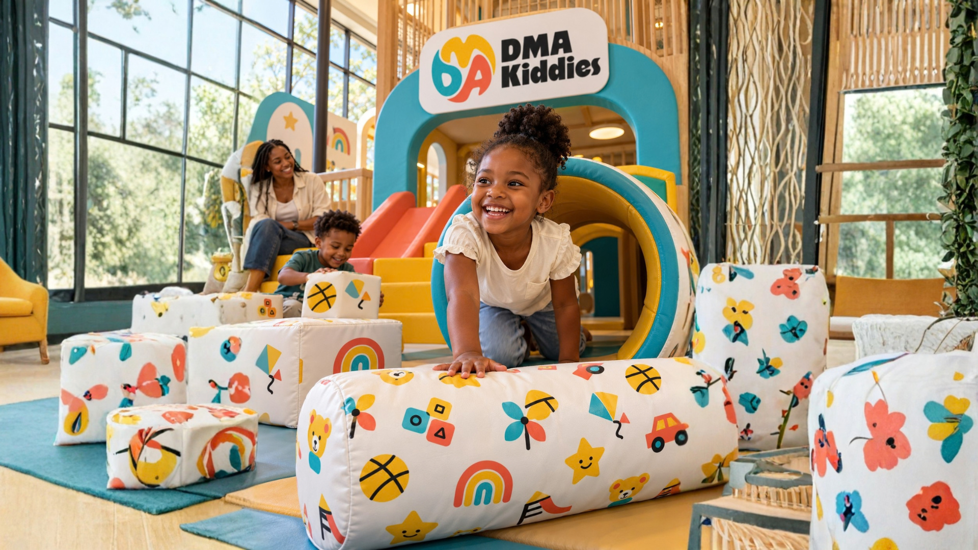
To demonstrate how the system could work, we developed realistic application concepts around moments of shopping, gifting, getting ready and playing together.
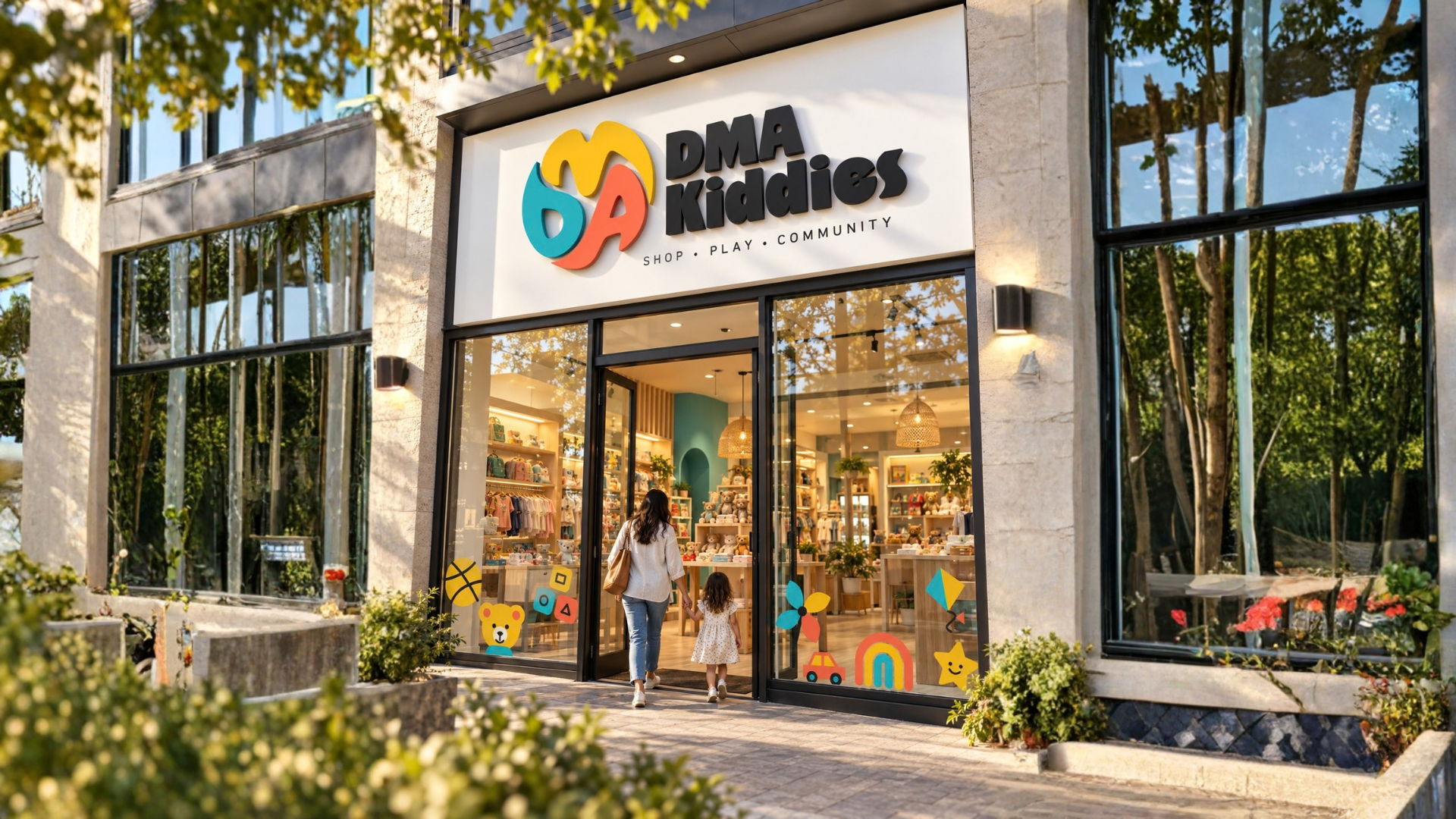
The visuals show patterns printed onto tissue paper, stitched onto bags and applied to soft-play equipment. Storefront signage demonstrates how the mark could welcome families into a physical space.
These concepts explore the brand’s future possibilities; they are not photographs of existing DMA Kiddies products or premises.
A digital home for the brand
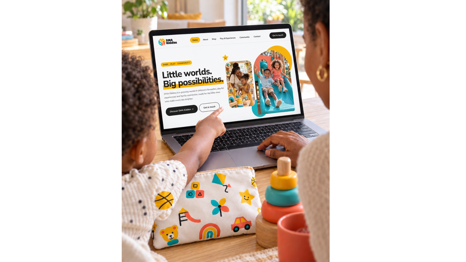
We carried the identity into a website that introduces the business through Shop, Play and Community.
Rounded photography, bold colour sections and clear navigation create a welcoming experience. Small animations bring the custom icons and interface to life, extending the playful character of the identity online.
At launch, the website focuses on introducing DMA Kiddies, sharing its vision and inviting enquiries, with room for its offering to develop.
The pieces, connected.
DMA Kiddies now has a cohesive identity system covering its logo, colours, typography, icons, patterns and digital presence.
The accompanying guidelines provide a practical foundation for future applications, helping the brand maintain a consistent appearance as it grows.
A little world, designed for big possibilities.
Another perspective.
 View project
Imvelo Accounting and Tax Services
Accounting & Tax Services
 View project
BeetFresh
Plant-Based Food & Beverage