
Mocares Brand Identity Design
An upward visual rhythm. A crisp, adaptable identity for a financial exchange brand.

- Sector
- Financial exchange
- Studio
- Bennie Design Studio
- Presentation
- Original portfolio artwork
Mocares is described in the artwork as a fast and reliable exchange. The presentation includes logo anatomy, a vivid blue palette, monochrome alternatives, stationery, social graphics, an app-icon demonstration and physical applications. The app imagery demonstrates the identity in a digital setting; it does not document an app build.
Original project on BehanceSource: the accessible Behance artwork by Benjamin Olofinyo / Bennie. Original image compositions are preserved. Individual project descriptions and additional production credits were not accessible from the blocked project pages.
An initial with a sense of progression.
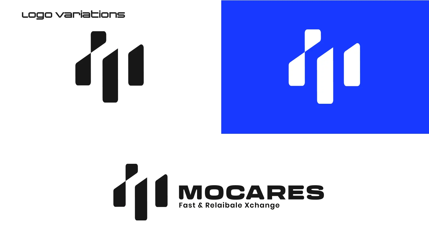
The logo-anatomy panel identifies the initial M as the starting point. Its separated rising strokes create a compact symbol with an upward rhythm. Alongside a substantial uppercase wordmark, the symbol balances motion with a clear, stable name treatment.


One blue family. Multiple settings.
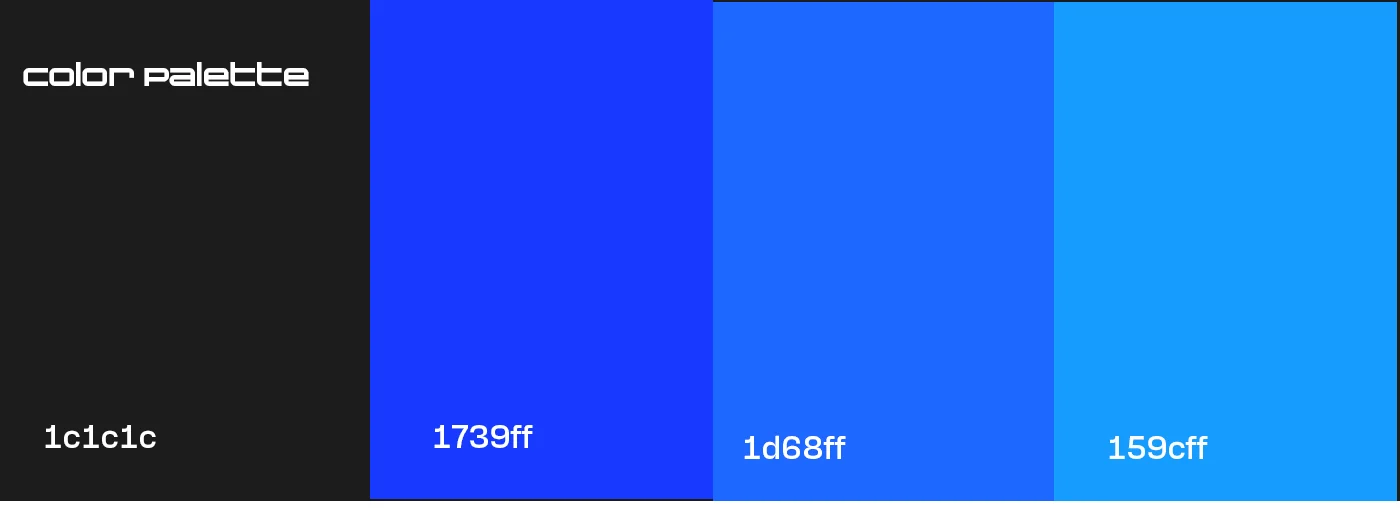
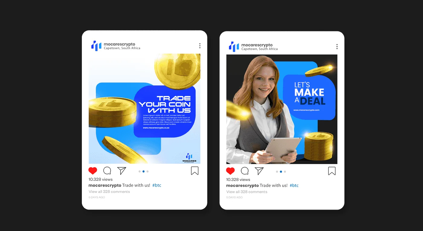
The palette pairs a dark neutral with a sequence of saturated blues. Those colours carry into social layouts and printed materials. The system uses the same logo and colour relationships across these settings, rather than treating each application as a separate style.

Recognition at different scales.
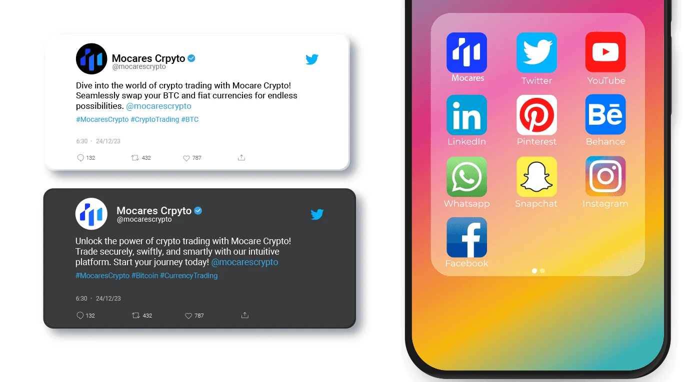
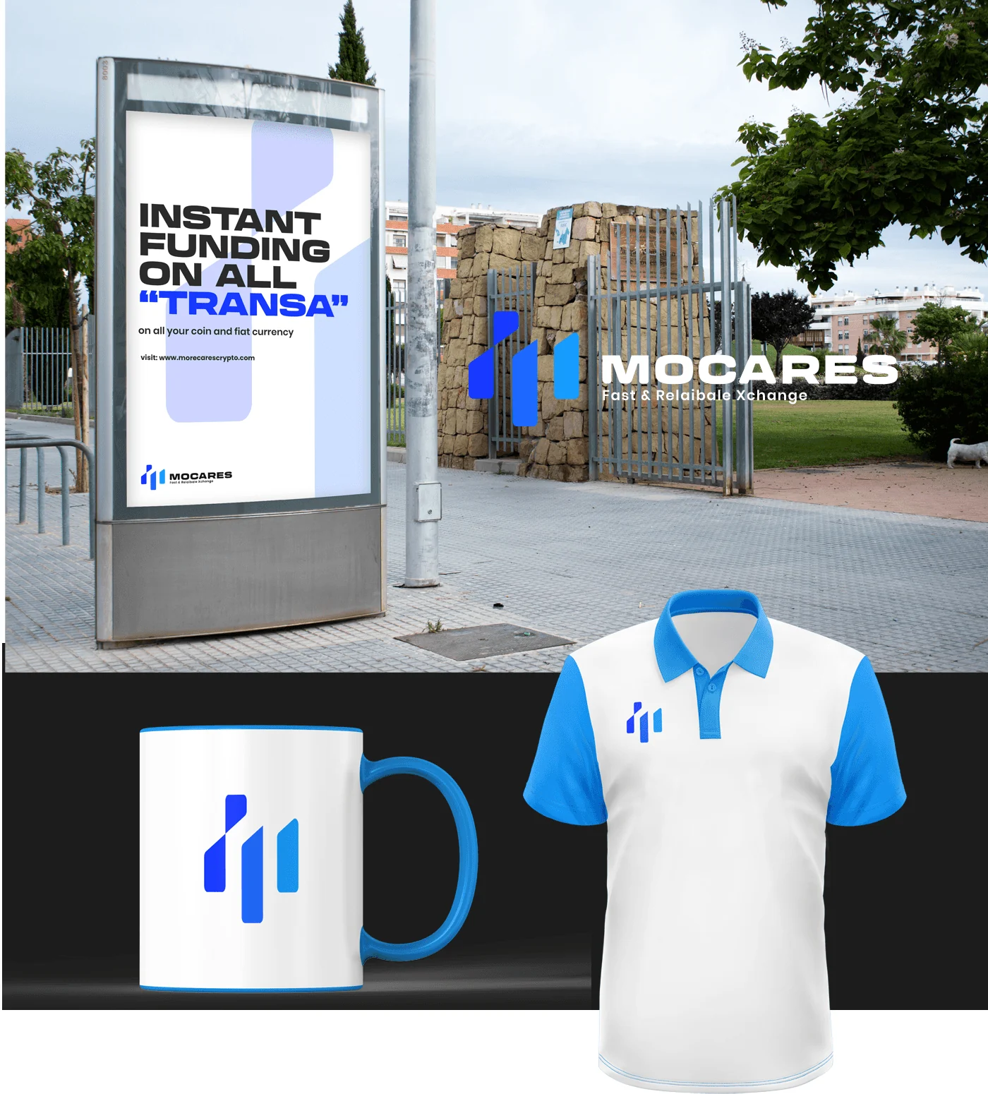
The compact M works as an app-style icon, while the full lockup appears on outdoor displays and merchandise. These are presentation mockups showing the reach of the visual system, not claims about deployed products or completed campaigns.
The pieces, connected.
An exchange-brand identity with a compact symbol, wordmark, palette and applications spanning print, social media, digital icons, outdoor displays and merchandise. Delivery and performance beyond the shown design work are not documented.
Another perspective.
 View project
BeetFresh
Plant-Based Food & Beverage
 View project
DMA Kiddies
Children’s retail & family experiences