
BeetFresh
A fresh identity for eating more planted.

- Client
- BeetFresh
- Sector
- Plant-Based Food & Beverage
- Studio
- Bennie Design Studio
- Scope
- Logo Design & Visual Identity
- Creative direction
- Olofinyo Temitope Ben
- Presentation
- Visual identity & concept mockups
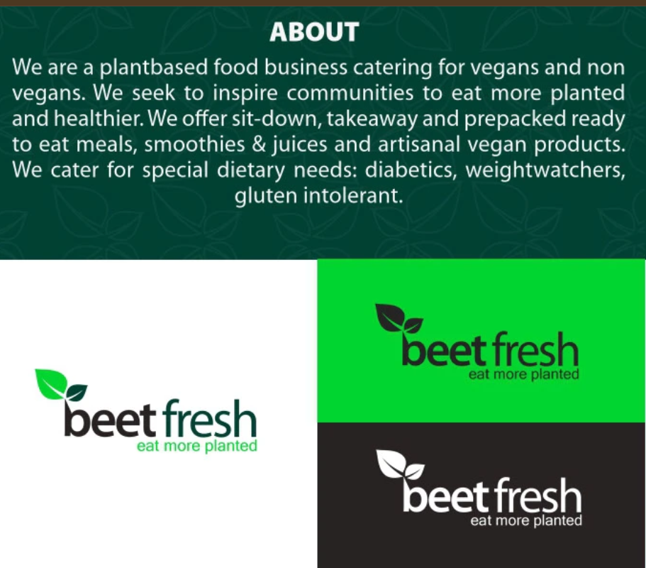
Plant-based eating starts with an invitation. BeetFresh serves vegans and non-vegans through sit-down meals, takeaways, ready-to-eat food, smoothies, juices and artisanal vegan products. Its ambition is to encourage more people to make plant-based food part of everyday life. That invitation sits at the heart of the brand: “eat more planted.”
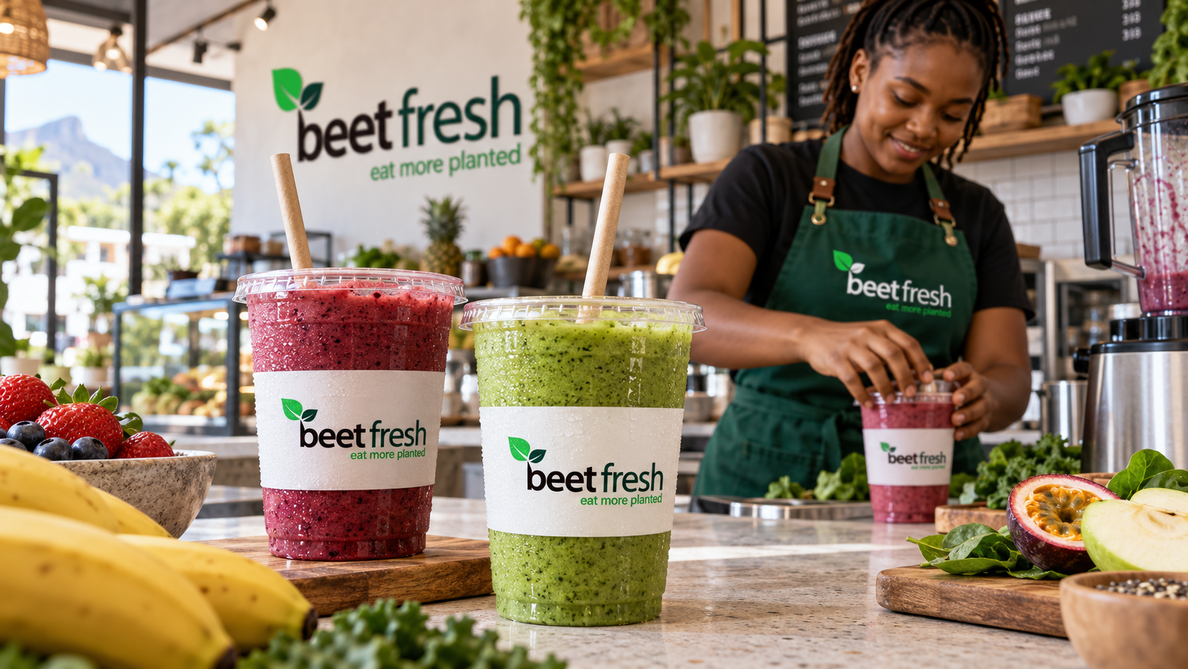
Case-study content and artwork supplied by Bennie Design Studio. Café, takeaway and smoothie scenes are realistic concept mockups demonstrating the identity, not photographs of an existing rollout.
The design challenge
The identity needed to make BeetFresh feel fresh, approachable and easy to recognise. It also needed to bring a varied offering together, giving meals, drinks, packaging and staff clothing a consistent visual presence.
Our direction focused on expressing the brand’s connection to plants while creating a practical system for everyday use.
The idea: rooted in the name
The logo brings together a leaf symbol and a lowercase wordmark.
The leaves make an immediate connection to plant-based food, while their placement above the “b” introduces the appearance of a growing shoot. The heavier treatment of “beet” and lighter “fresh” creates distinction within the name while keeping the wordmark connected.
A compact “bf” monogram combines the brand’s initials with the same leaf motif, providing a recognisable alternative for smaller applications.
Together, these elements give BeetFresh a visual signature rooted in its name and offering.
A palette that feels fresh
Bright green introduces energy and visibility. Deep green gives the identity depth and connects it to the natural world. Black strengthens the wordmark, while white creates space and clear contrast.
The palette works across both light and dark applications—from white food packaging to deep-green uniforms and carrier bags.
Typography with a clear purpose
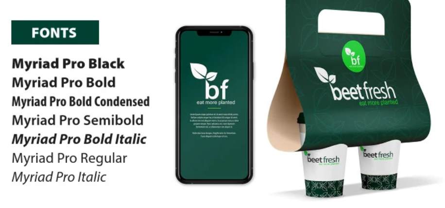
Myriad Pro supports the identity with a versatile, readable type system.
Black, Bold and Semibold weights establish strong headings. Regular keeps supporting information clear, while Condensed and Italic styles provide flexibility across packaging and promotional materials.
The result is a consistent approach to communication across different formats.
A visual system beyond the logo
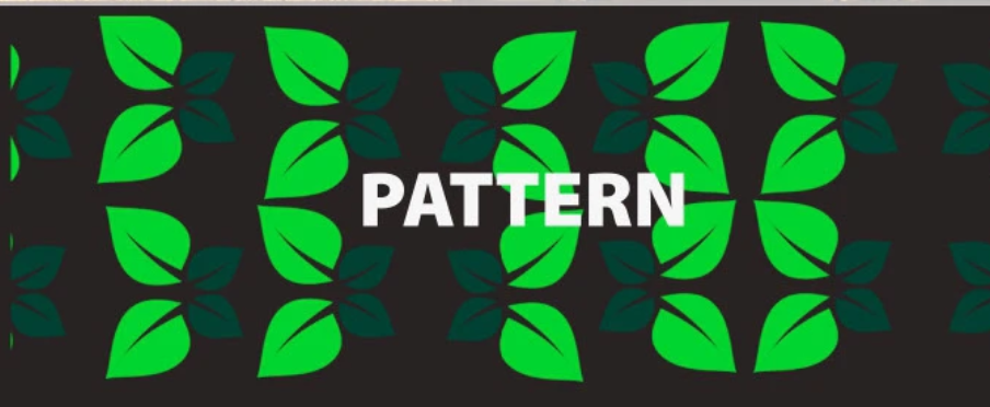
An outlined leaf pattern extends the core symbol into a supporting graphic.
Used across bags, cups and backgrounds, it creates texture and continuity without relying on a large logo in every space. Full-colour, black and white logo treatments allow the identity to adapt to different surfaces while retaining its character.
The identity in use
The case-study applications explore BeetFresh across staff uniforms, takeaway bags, food bowls, drink cups and digital touchpoints.
The realistic concept mockups place the identity within everyday moments: enjoying a café meal, collecting a takeaway and preparing fresh smoothies. They demonstrate how the branding can remain visible and connected while becoming part of the customer experience.
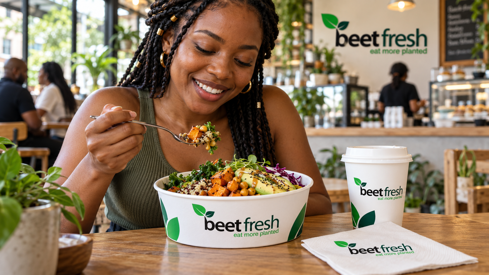
The pieces, connected.
BeetFresh’s visual identity brings its plant-based offering into a clear, approachable system. The leaf symbol establishes the connection to food, the green palette gives it freshness, and the tagline turns the brand’s purpose into a simple invitation.
BeetFresh. Eat more planted.
Brand identity by Bennie Design Studio. Creative direction and design: Olofinyo Temitope Ben.
Another perspective.
 View project
Kea Klear
Water & refreshment
 View project
ModuBuild
Prefabricated & Modular Construction