
ModuBuild
A modular identity for a smarter way to build.

- Client
- ModuBuild
- Sector
- Prefabricated & Modular Construction
- Studio
- Bennie Design Studio
- Scope
- Logo Design & Visual Identity
- Creative direction
- Olofinyo Temitope Ben
- Presentation
- Visual identity & application mockups
ModuBuild provides modern prefabricated structures for individuals, businesses and organisations. Its approach centres on modular construction: components built off-site and assembled on location, offering greater flexibility, faster construction and reduced material waste. The name brings that approach together. “Modu” comes from modular, while “Build” makes the company’s purpose clear.
Original project on BehanceCase-study content and application mockups supplied by Bennie Design Studio, alongside the original Behance identity presentation. The mockups explore the identity in context; they do not document completed premises, production or commercial results.
The challenge
The identity needed to communicate both structural strength and a modern approach to construction. It also needed to work across practical environments—from workwear and vehicles to site signage and company materials.
Our design direction focused on making the business recognisable through a visual language rooted in how it builds.
The idea: built from the same principles
Modular construction turns individual components into a complete structure. We used that principle as the foundation of the identity.
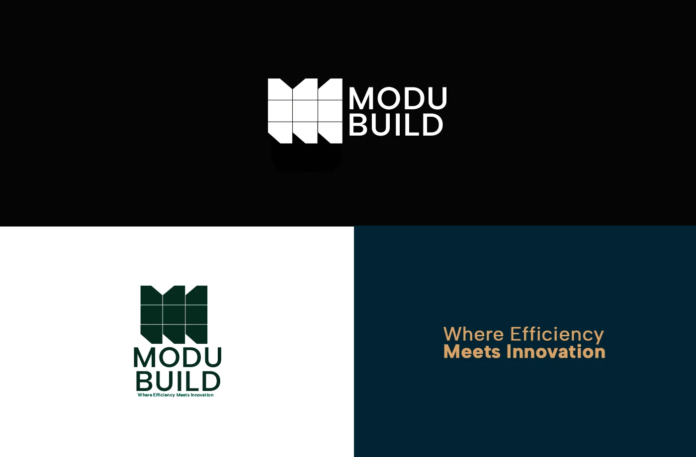
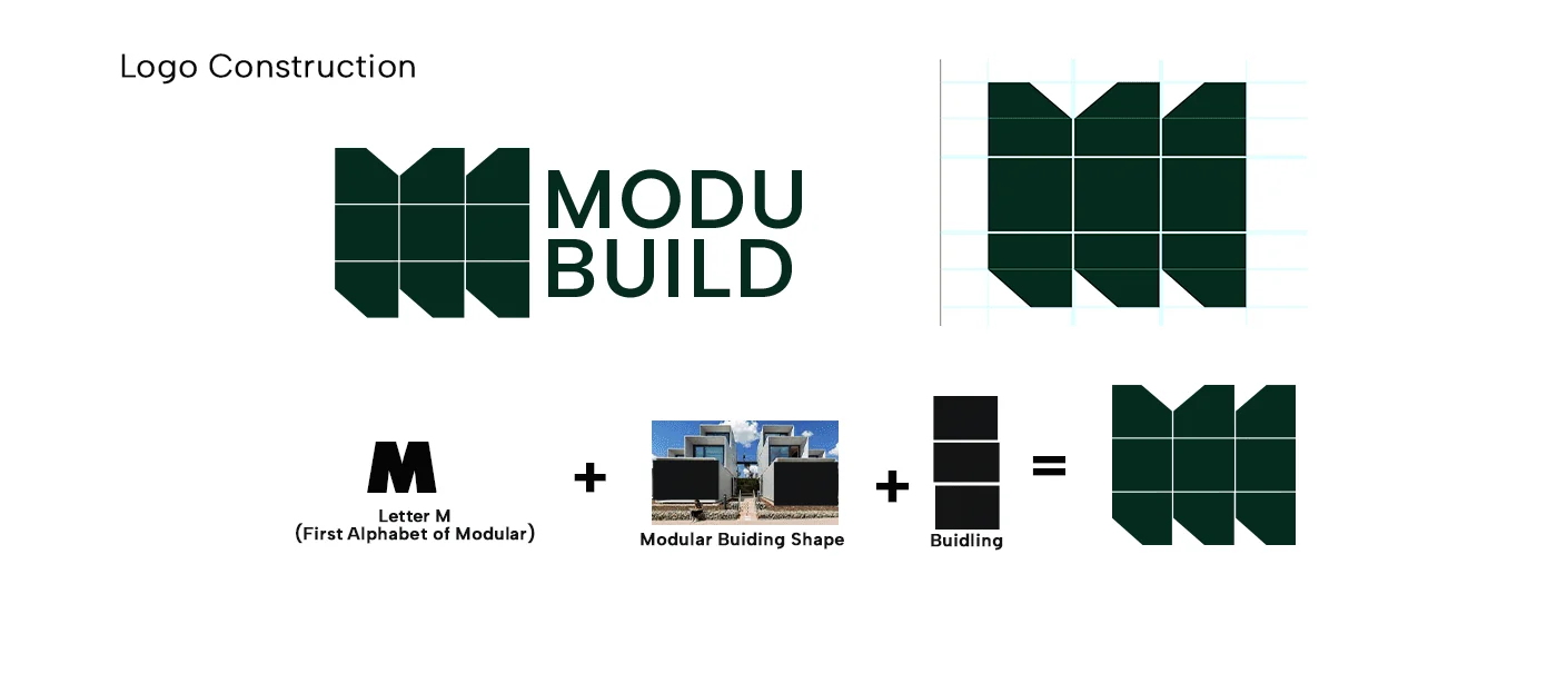
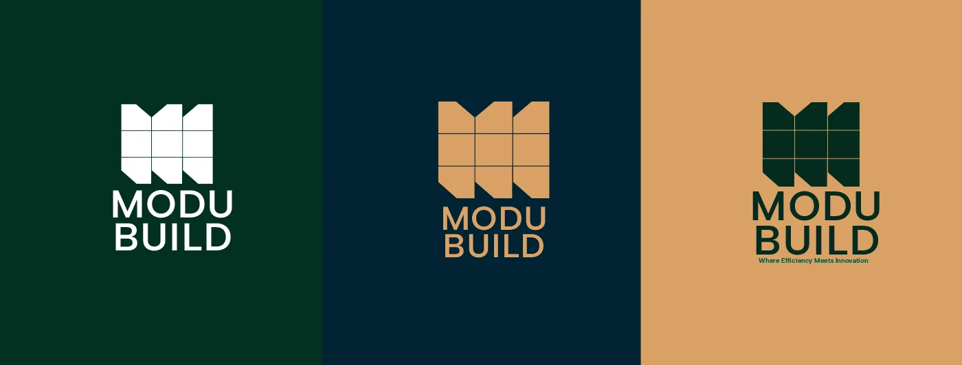
The logo combines the letter M, the silhouette of modular buildings and a grid of construction blocks. Together, these elements form a compact geometric mark that connects directly to the company’s name and method.
Its repeated sections express assembly and order. The angular edges introduce movement, giving the symbol a distinctive silhouette while retaining a sense of stability.
The visual identity
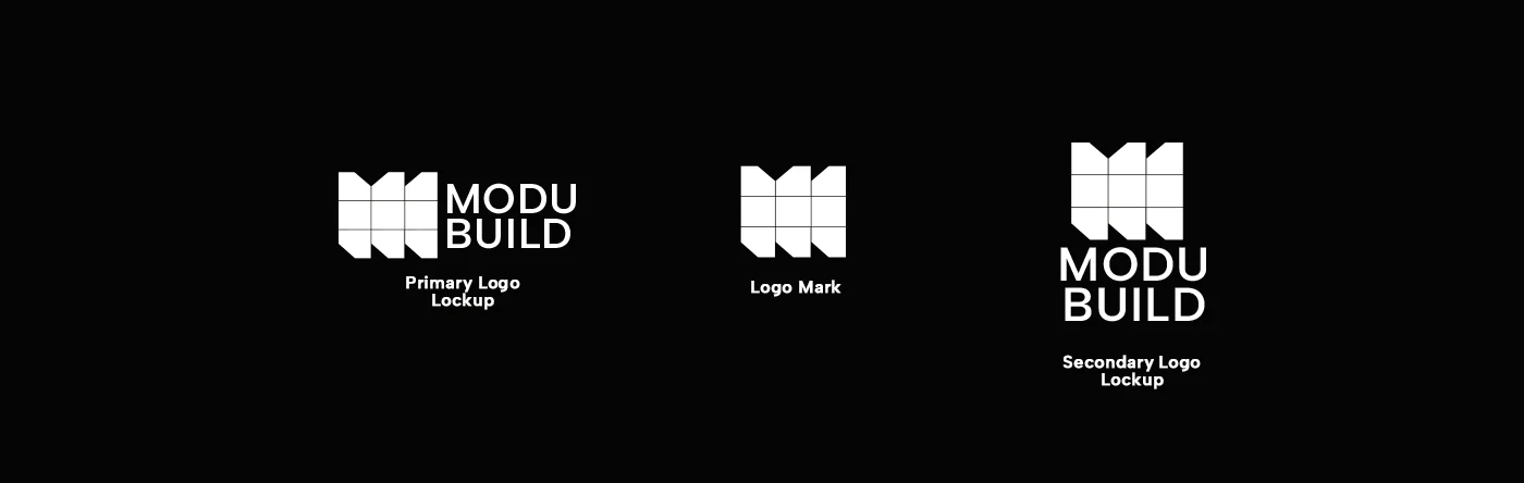
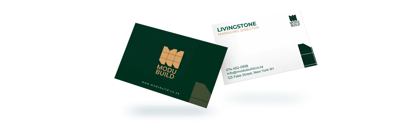
A structured logo system The geometric symbol pairs with a bold uppercase wordmark. Horizontal and stacked arrangements allow the identity to adapt to different spaces, while the symbol can stand independently where a compact brand marker is needed.
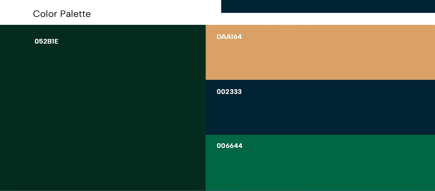
A grounded colour palette Deep green, dark navy and warm sand create a balance of strength and warmth. The darker colours give the identity a confident presence; sand introduces a connection to the materials and environments of construction. White provides clarity and contrast.
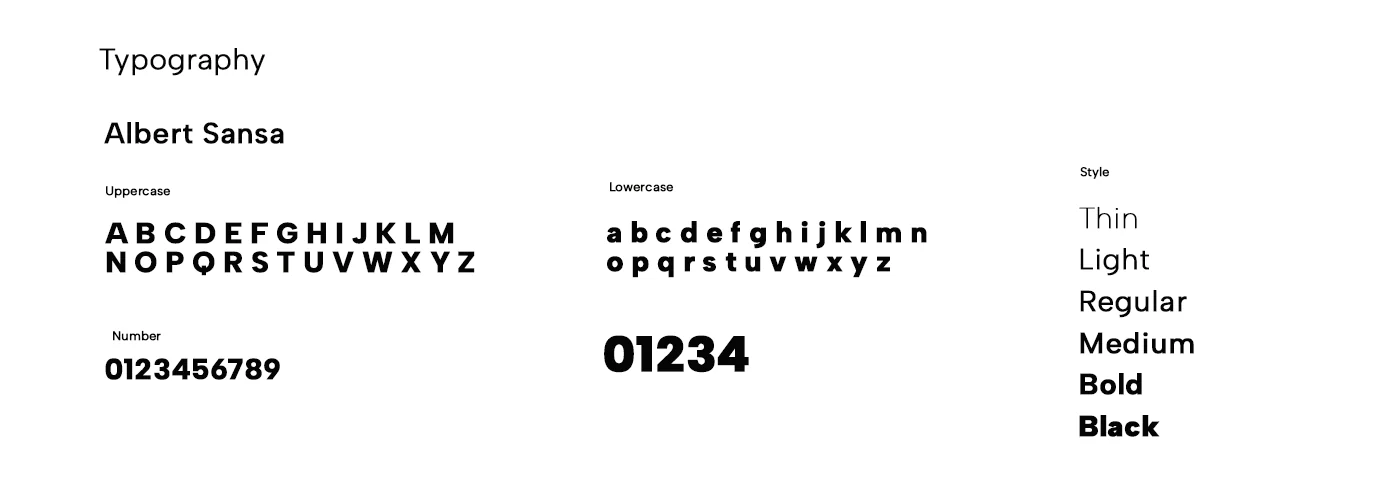
Clear, practical typography Clean sans-serif typography supports straightforward communication. Strong headings establish hierarchy, while lighter weights keep supporting information accessible and easy to read.
The identity in use
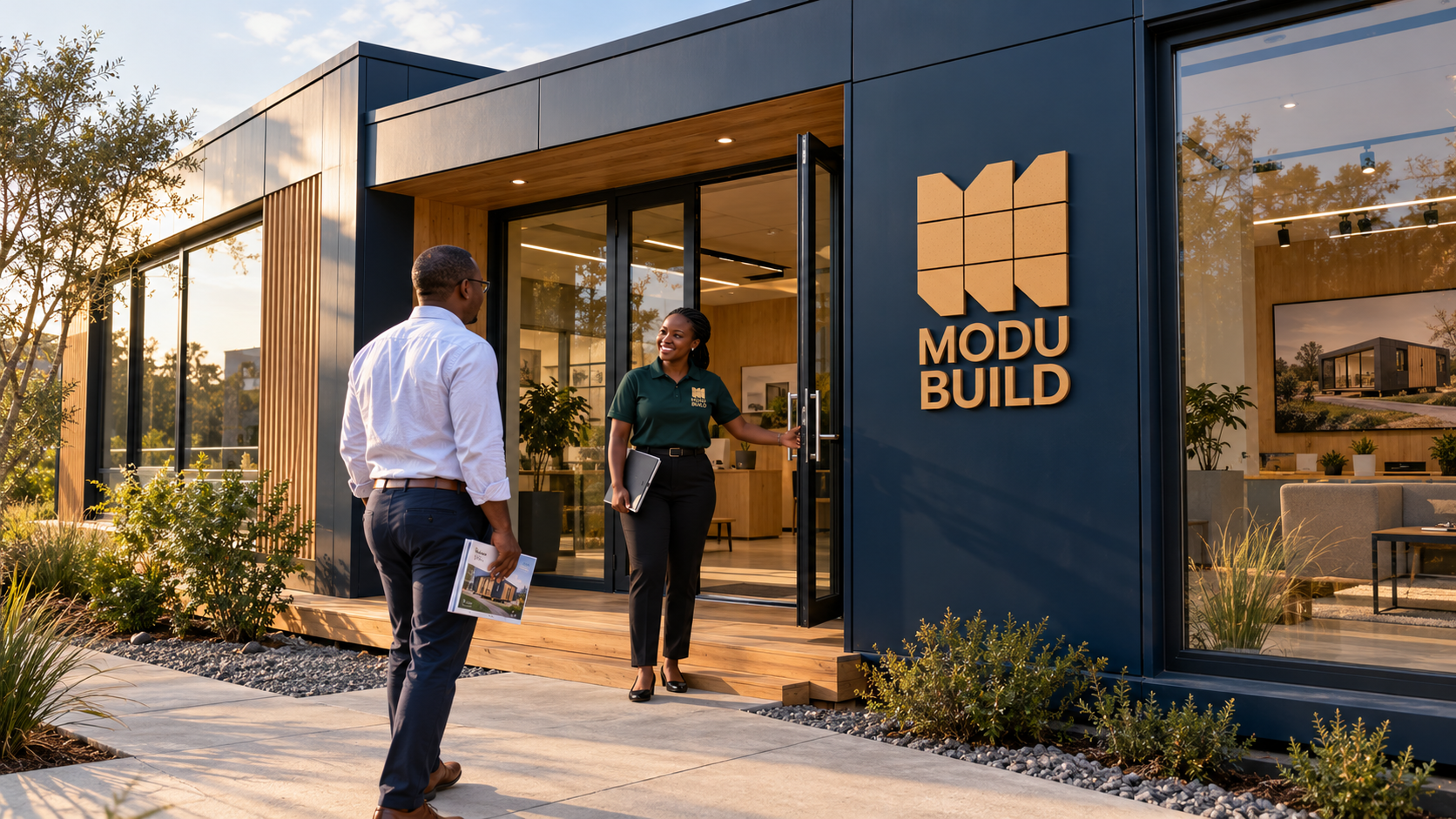
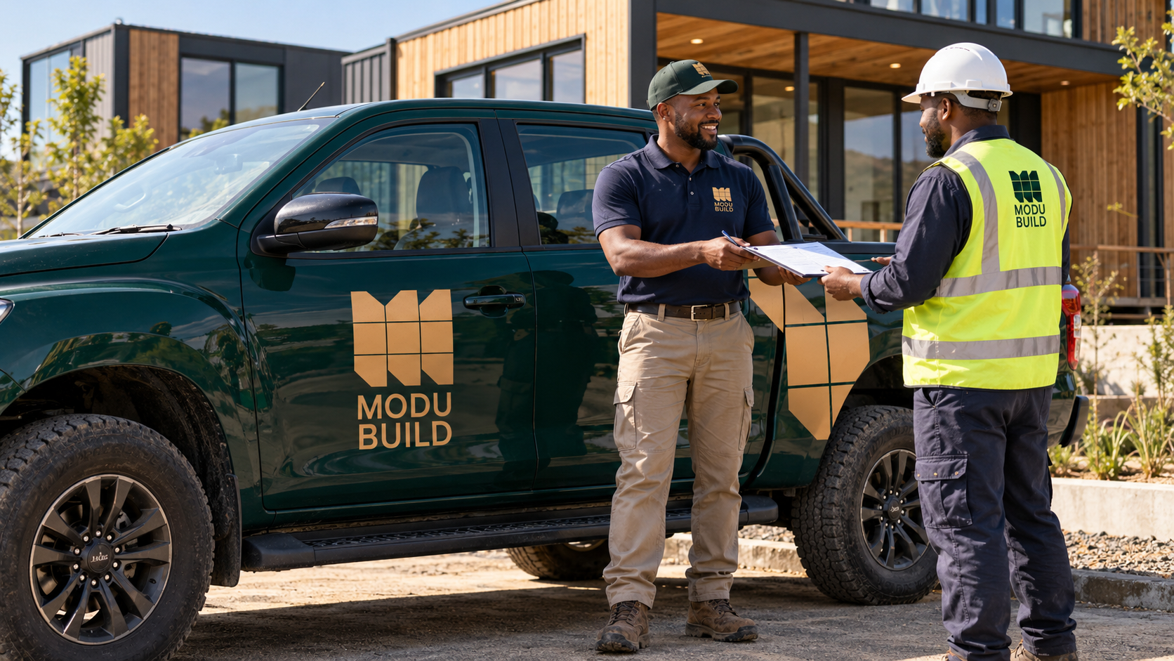
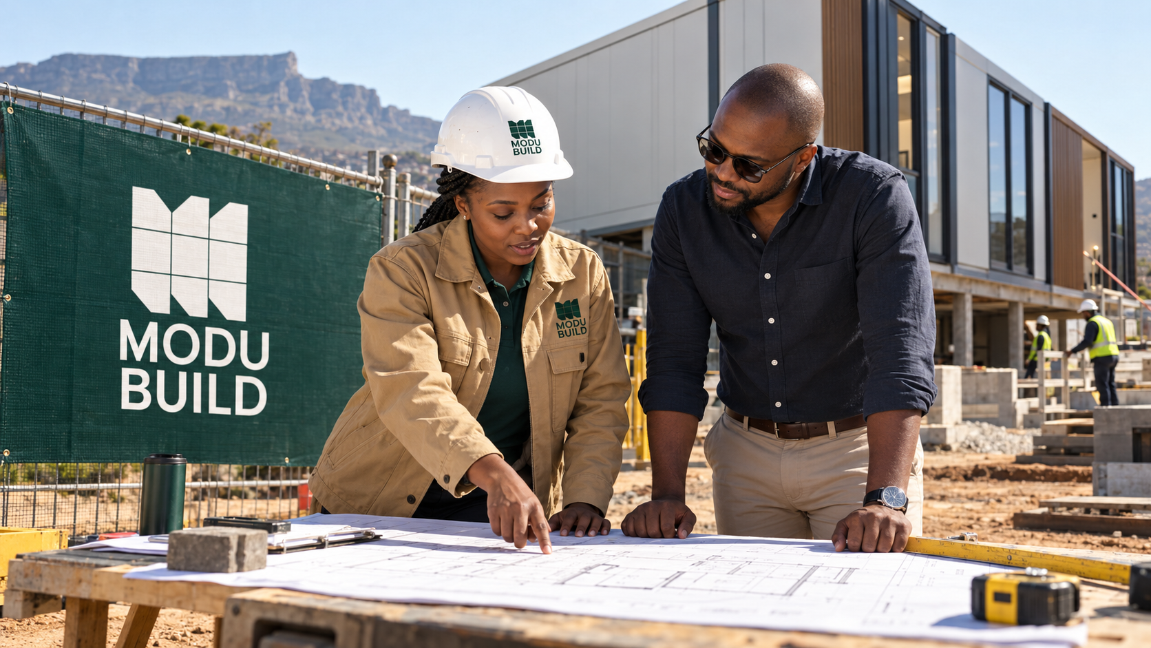
The case-study mockups explore the identity across branded workwear, vehicle graphics, site signage and a showroom exterior.
These applications show how the system can maintain a consistent presence at different scales—from a small embroidered chest logo to a prominent building sign. The repeated geometry also offers a foundation for supporting graphics across future brand materials.
Supporting brand materials
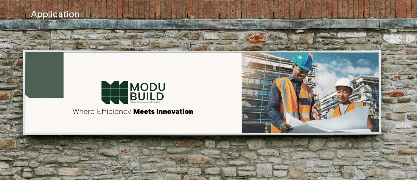
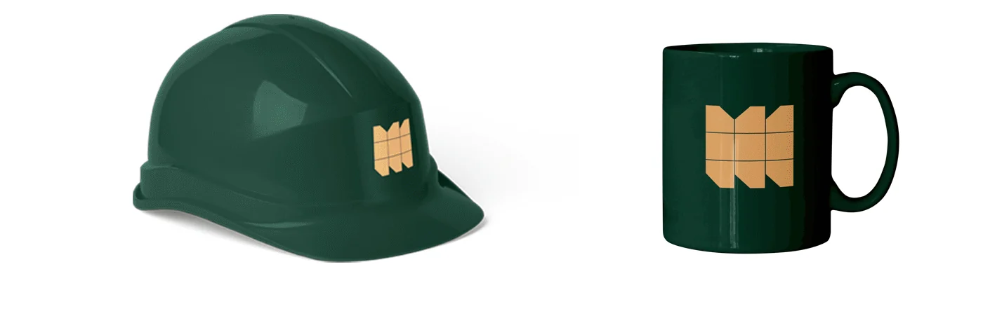
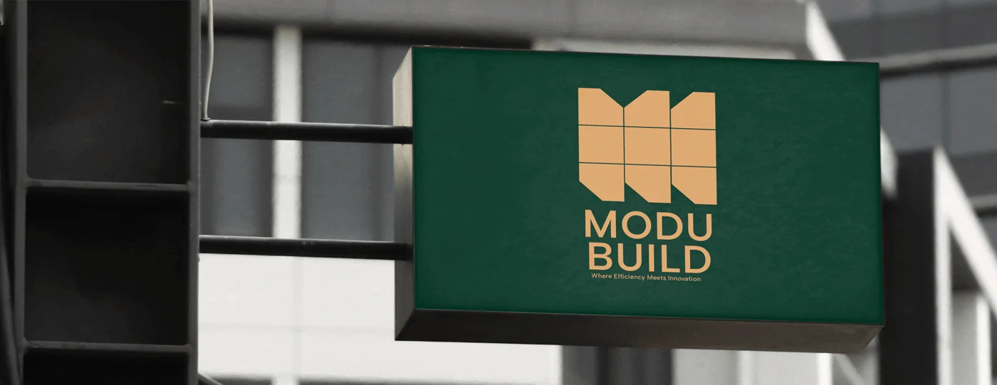
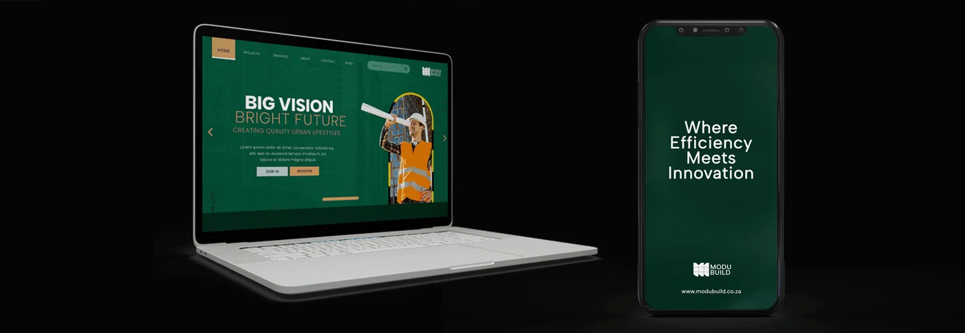
The original identity presentation extends the same visual system to outdoor communication, site equipment, signage and company materials. These supporting mockups demonstrate the logo across different formats; the device layouts are visual applications, not a documented website build.
The pieces, connected.
ModuBuild’s identity translates its construction approach into a clear, recognisable visual system. The logo, colours and typography work together to express a business built around structure, precision and flexibility.
ModuBuild — Where Efficiency Meets Innovation.
Brand identity by Bennie Design Studio. Creative direction and design: Olofinyo Temitope Ben.
Another perspective.
 View project
BeetFresh
Plant-Based Food & Beverage
 View project
DMA Kiddies
Children’s retail & family experiences