
Beacon Agile Logistics
Moving forward. Building confidence.

- Client
- Beacon Agile Logistics
- Sector
- Logistics
- Studio
- Bennie Design Studio
- Scope
- Logo Design & Visual Identity
- Creative direction
- Olofinyo Temitope Ben
- Presentation
- Visual identity & application mockups
Behind every delivery is someone counting on it. For Beacon Agile Logistics, the identity centres on that human expectation. It brings a confident, approachable presence to a business where movement matters, and so does the reassurance that someone is taking care of the journey. That idea is captured in three simple words: “We got you.”
Original project on BehanceCase-study content and visuals supplied by Bennie Design Studio. Warehouse, delivery and branded-product scenes are application mockups exploring the identity in context, not documentation of a commercial rollout or business results.
The design challenge
A logistics identity needs to communicate clearly in busy environments. It must be recognisable on a moving vehicle, readable on a parcel and practical enough to reproduce on staff uniforms.
Our direction brought together two qualities: the energy of an agile business and the steady presence customers look for when trusting a company with their goods.
The idea: confidence in motion
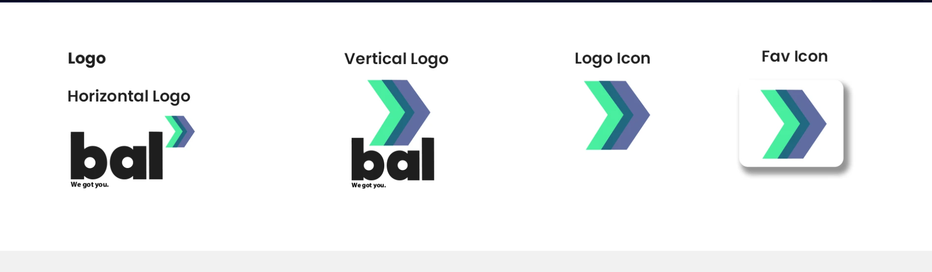
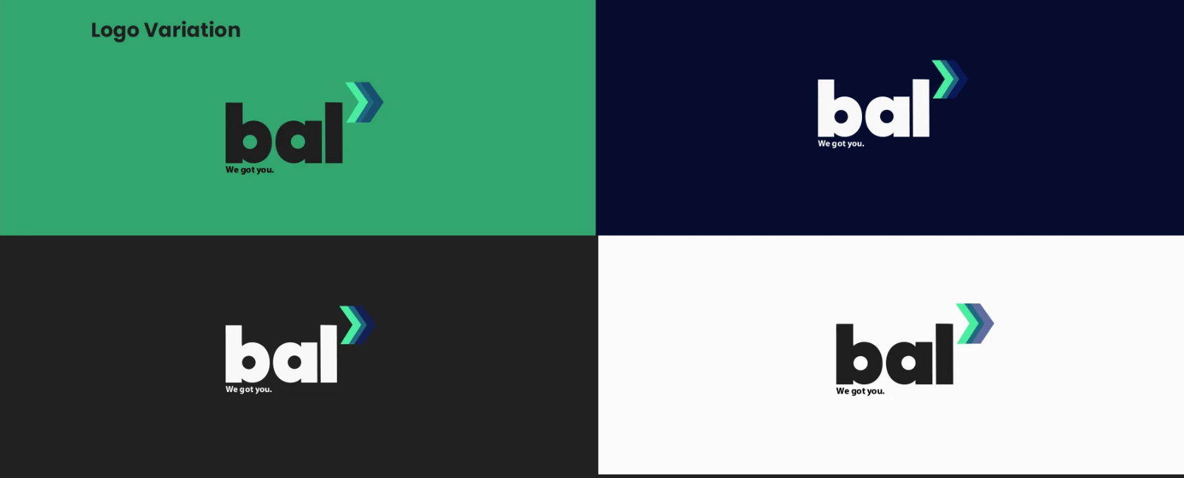
The logo pairs a bold lowercase “bal” wordmark with a layered, forward-facing chevron.
The initials give Beacon Agile Logistics a compact visual signature. The rounded letterforms introduce an approachable character, while their substantial weight gives the mark a confident presence.
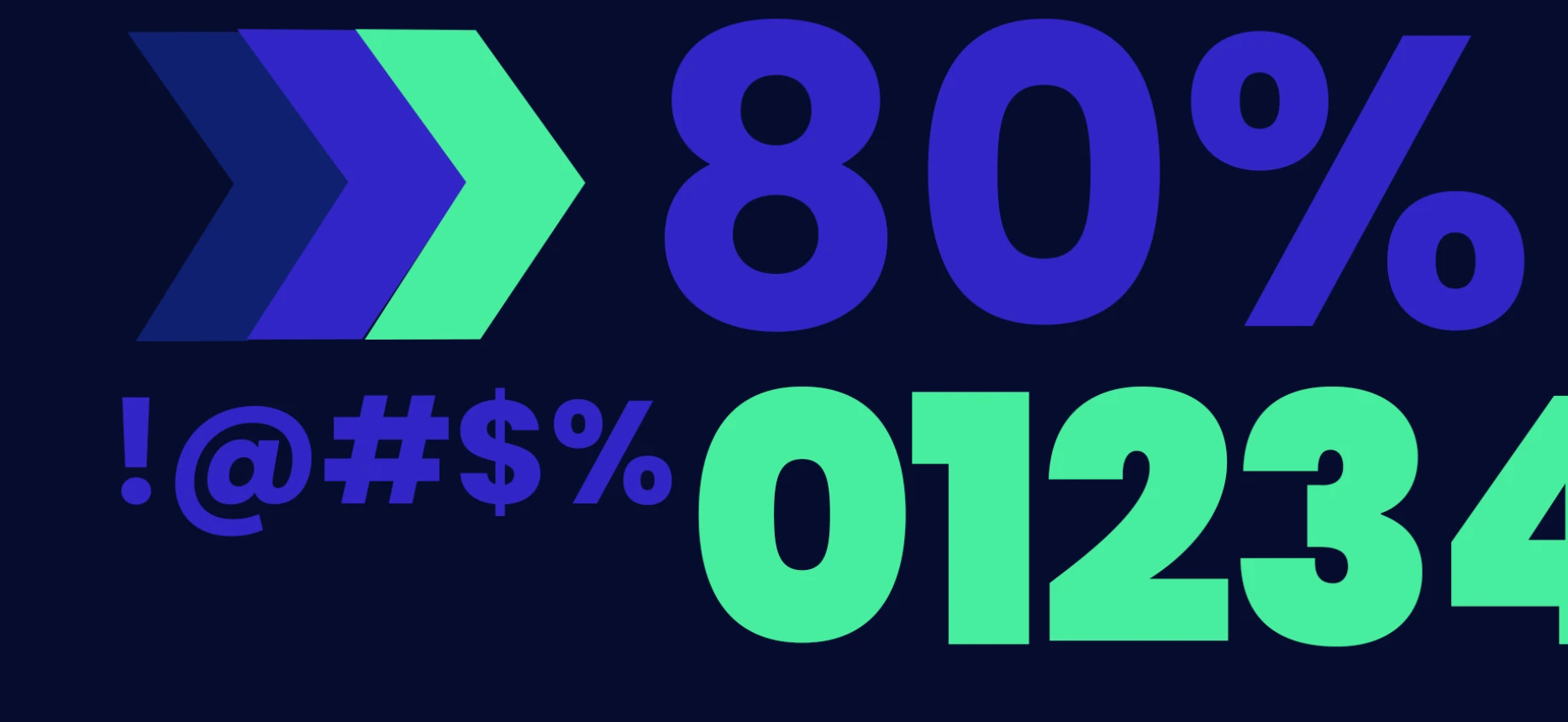
The chevron adds direction and momentum. Its overlapping colours create a sense of progression, connecting the identity to the movement at the heart of logistics.
Beneath the wordmark, “We got you.” gives the brand a direct, conversational voice. It expresses the reassurance the identity is designed to communicate.
A palette with energy and depth
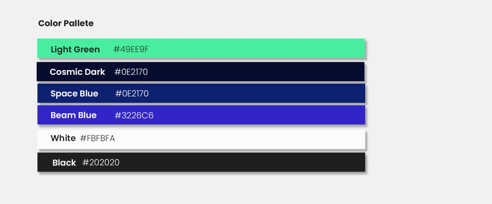
Light Green brings brightness and visibility to the system. Cosmic Dark and Space Blue provide depth, while Beam Blue adds a vivid accent. White and Black support clear contrast across lighter and darker backgrounds.
Together, these colours give the brand flexibility: a strong presence across large vehicle graphics and a clean, readable treatment on smaller printed materials.
Typography that keeps communication clear
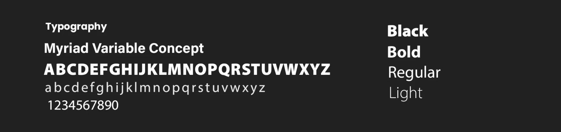
Myriad Variable Concept supports the identity with a straightforward, readable typographic system.
Bold and Black weights give headings emphasis. Regular and Light weights create a quieter supporting layer for detailed information. This range helps the brand maintain a consistent voice across promotional and operational communications.
The identity in use
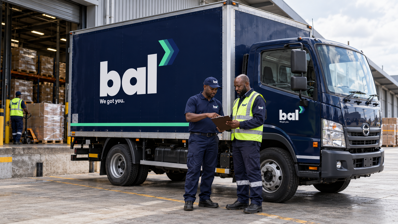
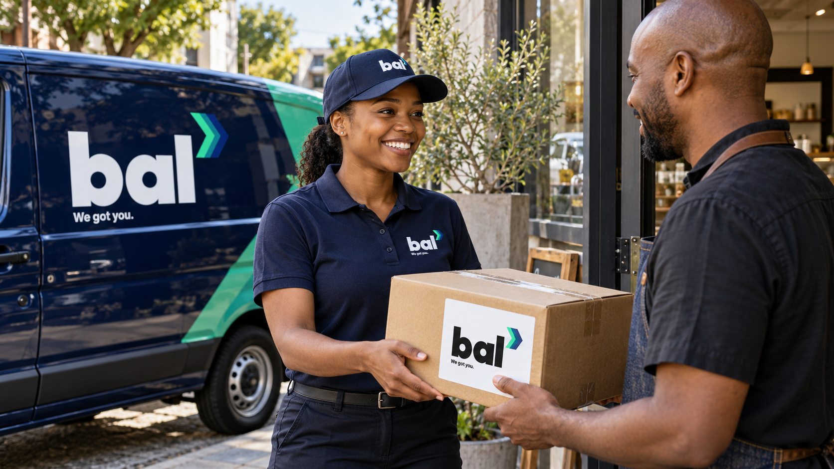
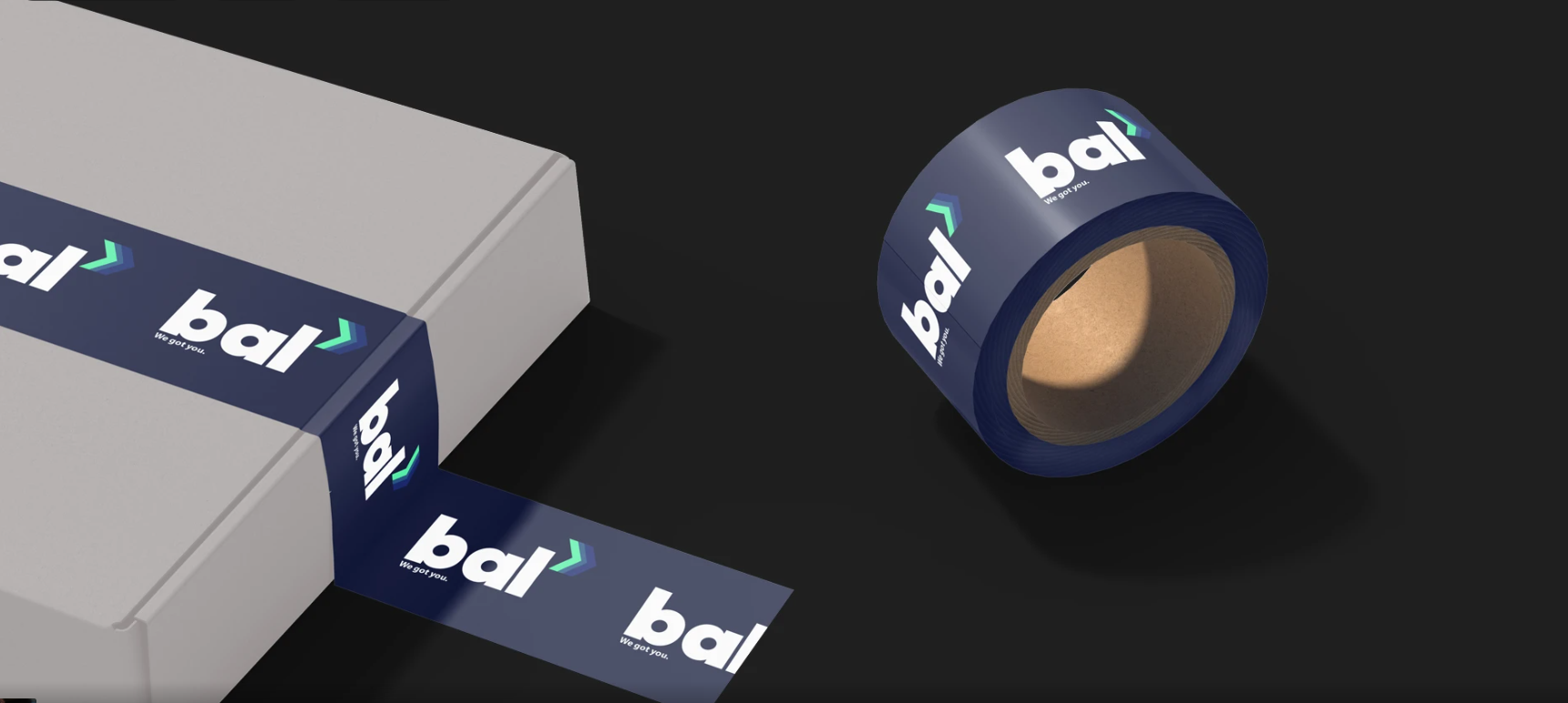
The case-study mockups explore the system across delivery vehicles, staff uniforms and parcel labels, placing the branding within realistic delivery and warehouse scenes.
Each application carries the same recognisable elements: the compact wordmark, coloured chevron and reassuring tagline. From a chest embroidery to a truck graphic, the identity is designed to remain connected and easy to identify.
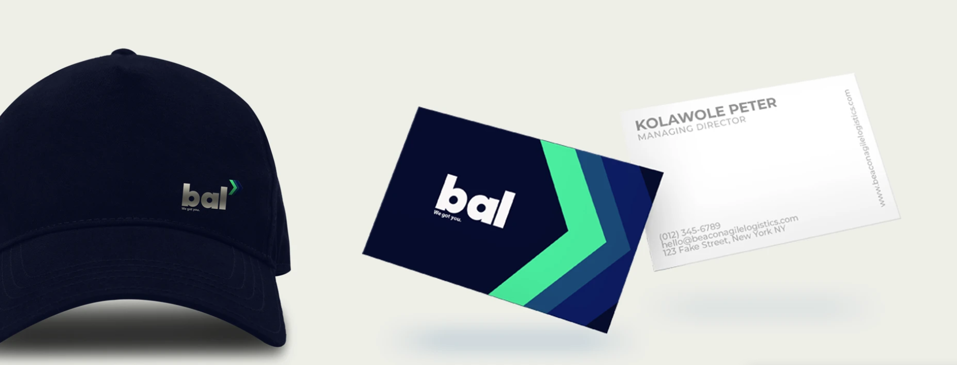
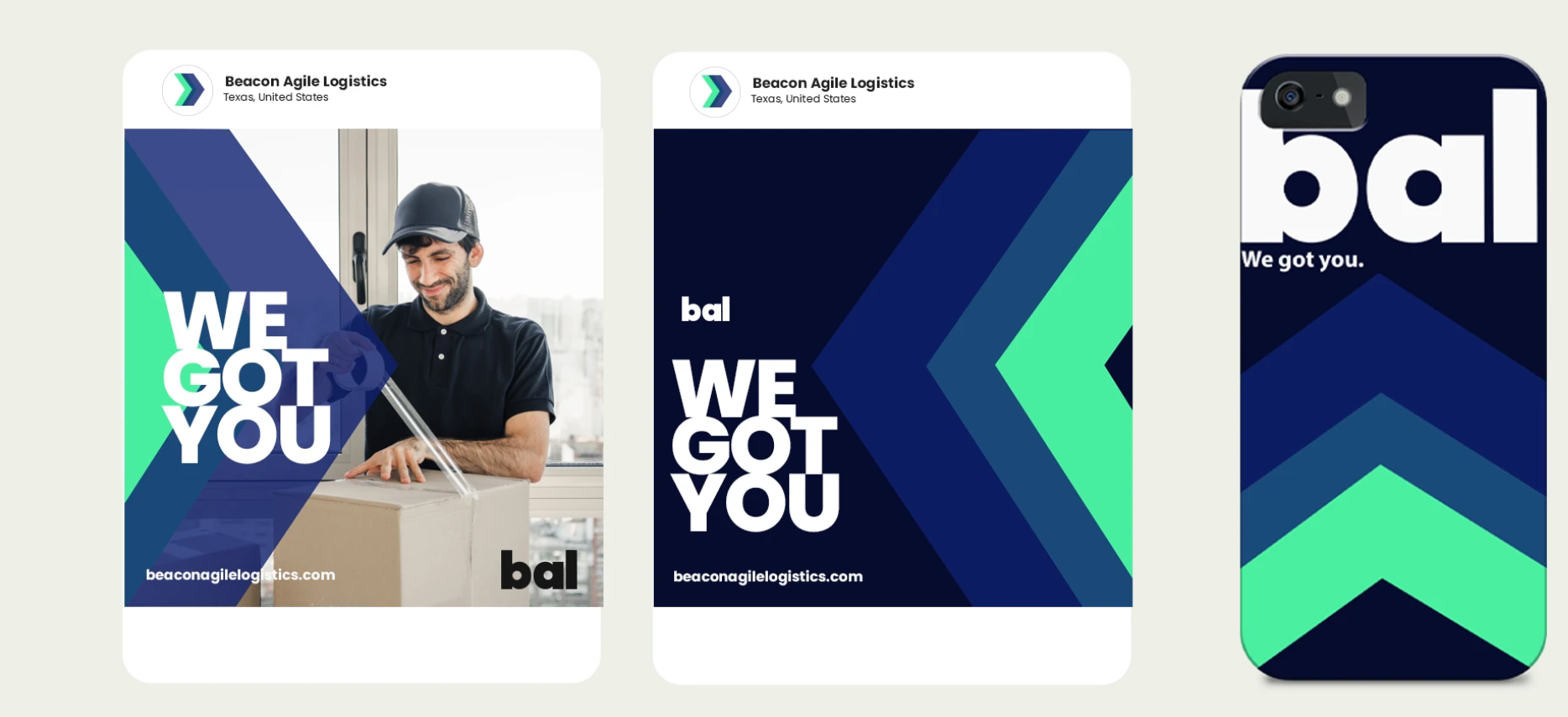
The pieces, connected.
Beacon Agile Logistics has a visual identity built around movement, clarity and reassurance. Its bold wordmark establishes recognition, its chevron gives it direction, and its tagline brings the customer into the story.
Beacon Agile Logistics. We got you.
Brand identity by Bennie Design Studio. Creative direction and design: Olofinyo Temitope Ben.
Another perspective.
 View project
BeetFresh
Plant-Based Food & Beverage
 View project
DMA Kiddies
Children’s retail & family experiences