
Vamoss Brand Identity & T-shirt Design
Culture. Coast. Movement. A bold, wearable identity inspired by Mozambique.

- Client
- Vamoss
- Sector
- Streetwear & cultural expression
- Studio
- Bennie Design Studio
- Scope
- Visual identity, logo design, colour direction, apparel graphics and garment application concepts
- Presentation
- Identity & apparel design study
Vamoss brings together the energy of streetwear, the atmosphere of festivals and the appeal of travel. Bennie Design Studio explored a playful identity rooted in Mozambique’s national colours, then extended it into T-shirt graphics that celebrate place, personality and movement. The result is a design study that treats clothing as both a brand touchpoint and a canvas for cultural expression.
Original project on BehanceThis case study draws on the supplied design rationale and artwork. Garment and lifestyle visuals present design applications; production methods and commercial results are not documented.
The challenge: identity with a sense of place
The direction was deliberately youthful and energetic—not corporate or formal. Vamoss needed a visual character that could connect with festival culture, streetwear and tourism while retaining a clear link to Mozambique.
We approached the identity through five qualities outlined in the presentation: bold, playful, national, touristic and wearable. Together, they shaped a system expressive enough to make a statement, but adaptable enough to live on a garment.
Expressive and energetic by design
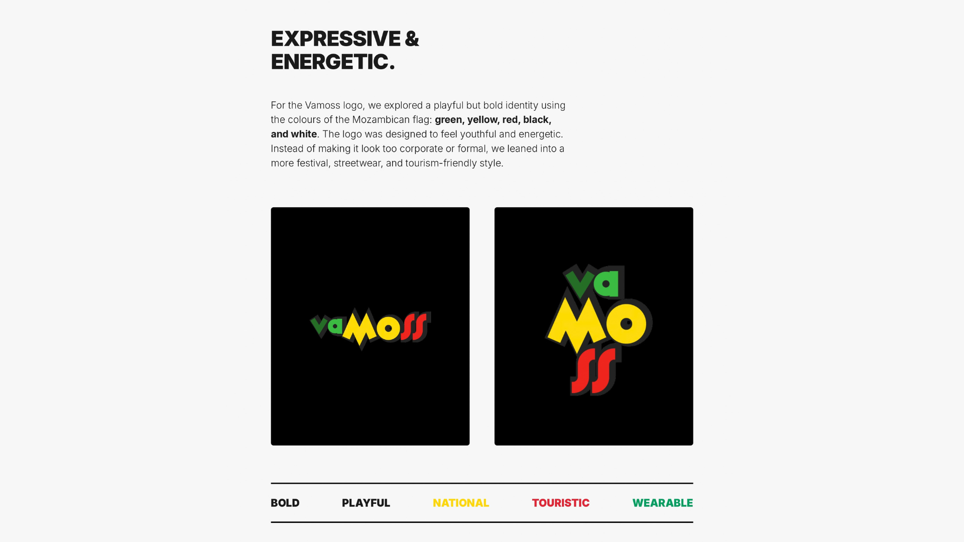
The palette takes its cue from the Mozambican flag: green, yellow, red, black and white. These colours give the identity a direct national reference without turning the logo into a literal flag reproduction.
The lettering combines contrasting shapes and proportions. A sharp, oversized M creates a strong centre, rounded forms introduce playfulness, and the repeated curved s shapes give the ending a distinctive rhythm. Dark outlines hold the composition together and strengthen its presence against different backgrounds.
The intention is an identity that feels lively and approachable, with the visual confidence of a streetwear graphic.
One name. Two ways to make a mark.
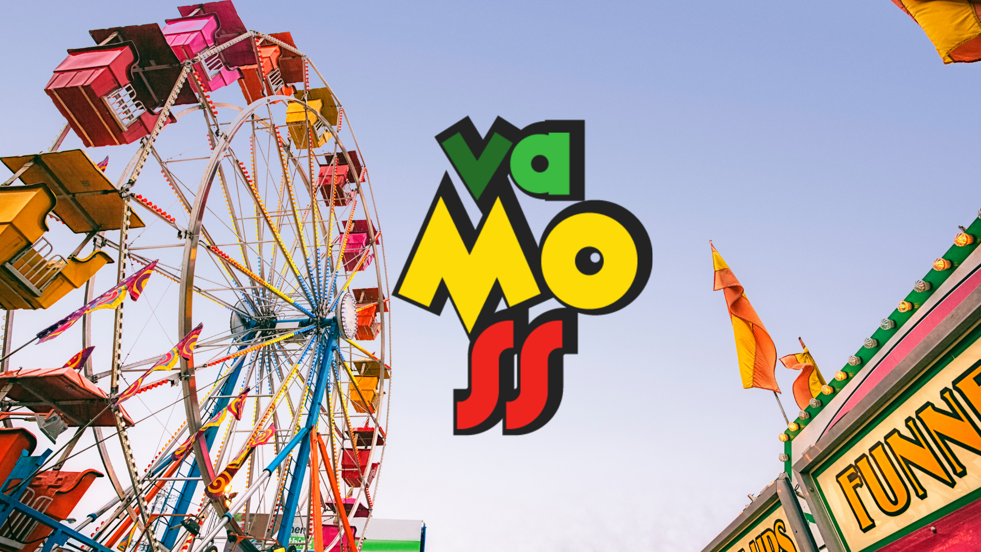
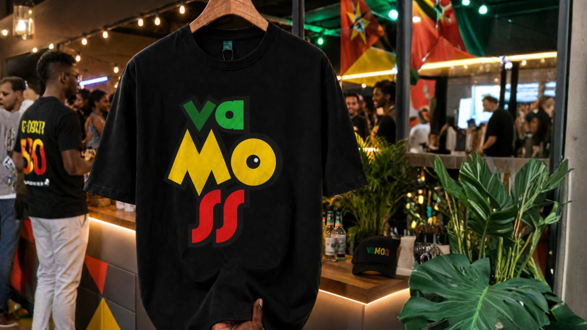
The horizontal arrangement gives Vamoss a broad signature suited to chest placements and wider compositions. The stacked arrangement reorganises the same lettering into a compact, poster-like mark that can take centre stage on a T-shirt.
Both retain the colour relationships and expressive letterforms, keeping the brand recognisable without relying on one fixed layout.
The fairground and streetwear presentations place the identity in the world it is designed to inhabit: social, active and full of energy.
Culture. Coast. Movement.
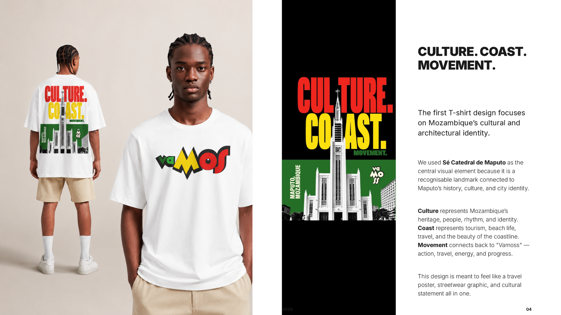
The first T-shirt graphic focuses on Mozambique’s cultural and architectural identity. Sé Catedral de Maputo becomes its central visual element—a recognisable landmark connected to the city’s history, culture and sense of place.
“Culture” speaks to heritage, people, rhythm and identity. “Coast” brings in tourism, beach life, travel and the beauty of the coastline. “Movement” connects back to Vamoss through action, travel, energy and progress.
Large, condensed lettering, blocks of national colour and a monochrome architectural image give the composition the character of a travel poster. On a garment, it becomes a streetwear graphic and a cultural statement at the same time.
Designed to be worn, not just displayed
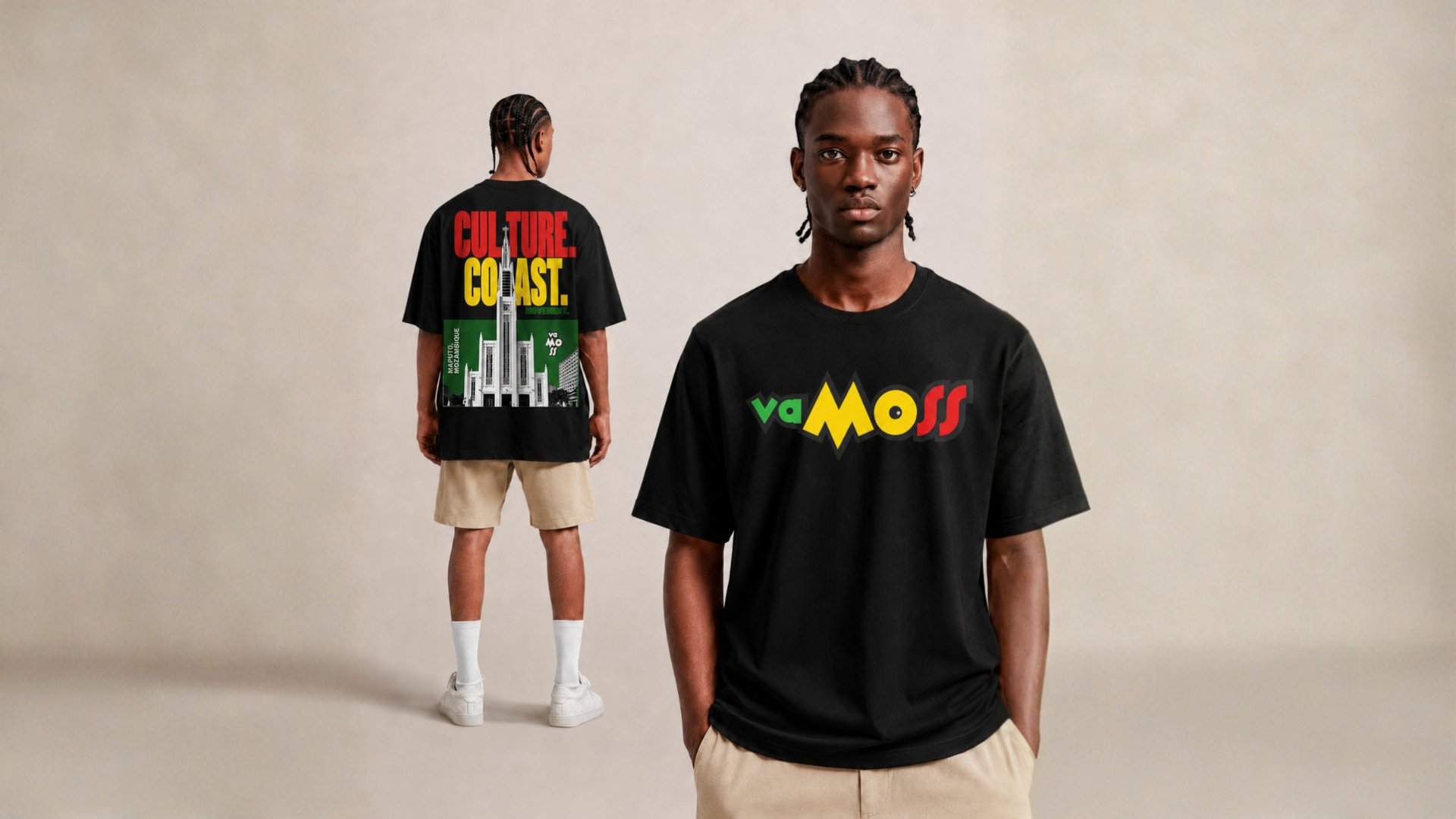
The garment applications balance a clear front signature with a more detailed back graphic. The horizontal mark identifies the brand at a glance, while the architectural composition gives the wearer a larger story to carry.
Black and white T-shirt treatments demonstrate how the same design language can shift between light and dark surfaces. A separate stacked-logo application makes the identity itself the main graphic.
The lifestyle presentation places that bolder treatment in a social setting, showing how the mark can belong to the atmosphere of an event as well as a studio presentation.
Room for personality
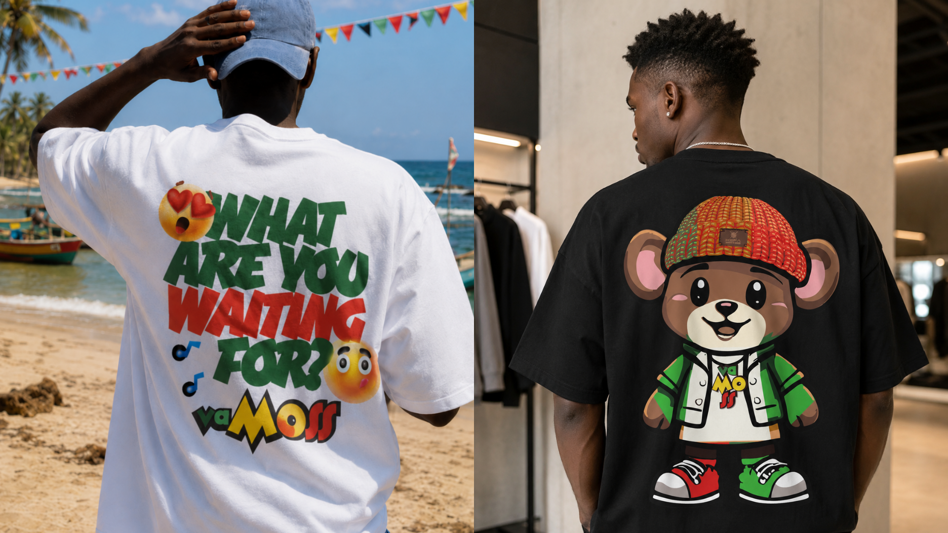
The additional apparel concepts extend Vamoss beyond a single landmark-led design. “What are you waiting for?” uses oversized, angled lettering, expressive faces and musical notes to create a more spontaneous, conversational graphic.
A character-led treatment takes a different approach: a teddy-bear illustration dressed in streetwear, with the stacked Vamoss logo on its shirt and green-and-red accents connecting it to the wider identity.
These directions broaden the visual vocabulary while preserving the same playful spirit. Cultural storytelling, bold typography and illustration can each take the lead without losing the brand’s energy.
The pieces, connected.
A coordinated identity and apparel design study built around expressive lettering, Mozambique-inspired colour and flexible logo arrangements.
The T-shirt concepts connect a Maputo landmark, cultural messaging and playful illustration to a consistent brand character. Horizontal and stacked signatures give the system variety across front placements, back graphics and lifestyle presentations.
Bold enough to stand out. Rooted enough to mean something.
Another perspective.
 View project
BeetFresh
Plant-Based Food & Beverage
 View project
DMA Kiddies
Children’s retail & family experiences