
Kea Klear Brand Identity Design
A refreshing wave of purity. A fluid identity that brings the character of water into the mark, the palette and the packaging.

- Sector
- Water & refreshment
- Studio
- Bennie Design Studio
- Presentation
- Original portfolio artwork
The Kea Klear presentation brings together a logo concept, a blue-to-teal palette, typography, bottle applications, stationery and outdoor advertising. Its written story centres on purity and freshness. The artwork credits Bennie as brand strategist; the published presentation shows the resulting visual direction rather than a full strategy document.
Original project on BehanceThe original Behance presentation and supplied product and lifestyle visuals inform this case study. Application imagery illustrates the identity in context; production, distribution and commercial results are not documented.
Water, translated into a visual language.
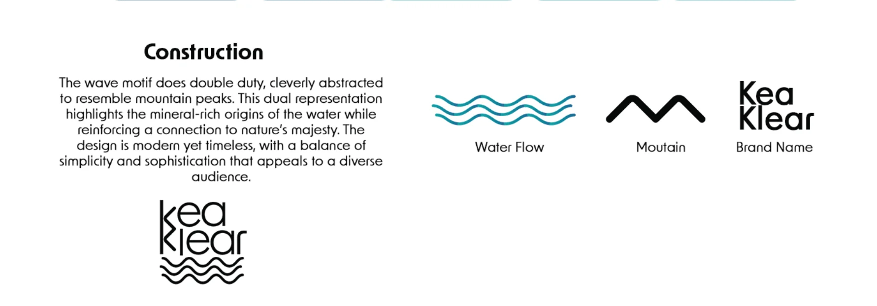
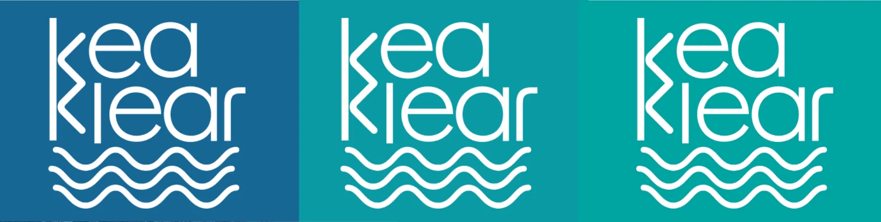
The construction panel combines flowing water lines, a mountain reference and the brand name. The repeated waves give the identity a gentle rhythm, while the stacked lettering keeps the composition compact. This is a mark that can sit quietly on a bottle or take centre stage in a poster.
A palette with a clear point of view.
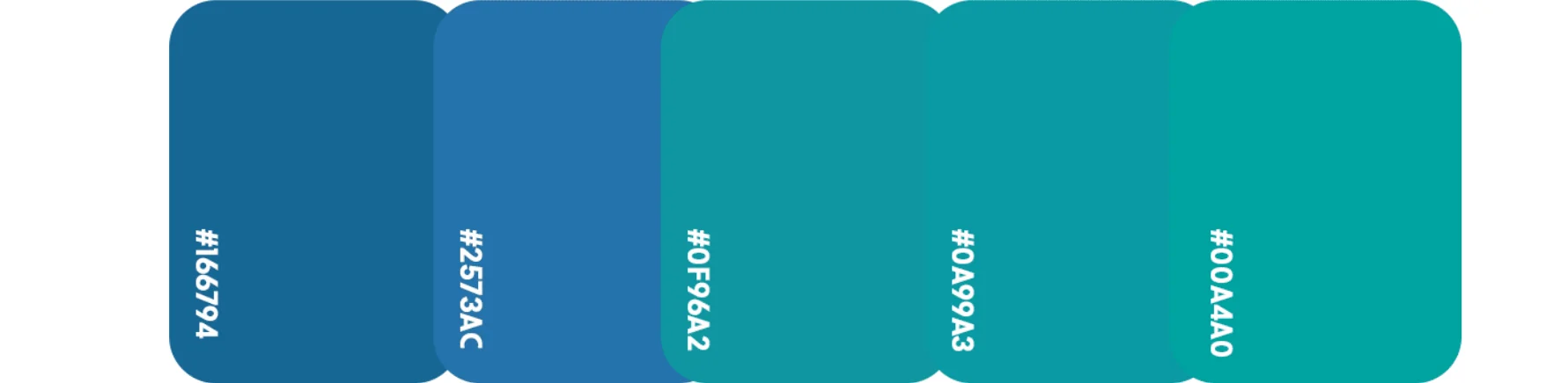
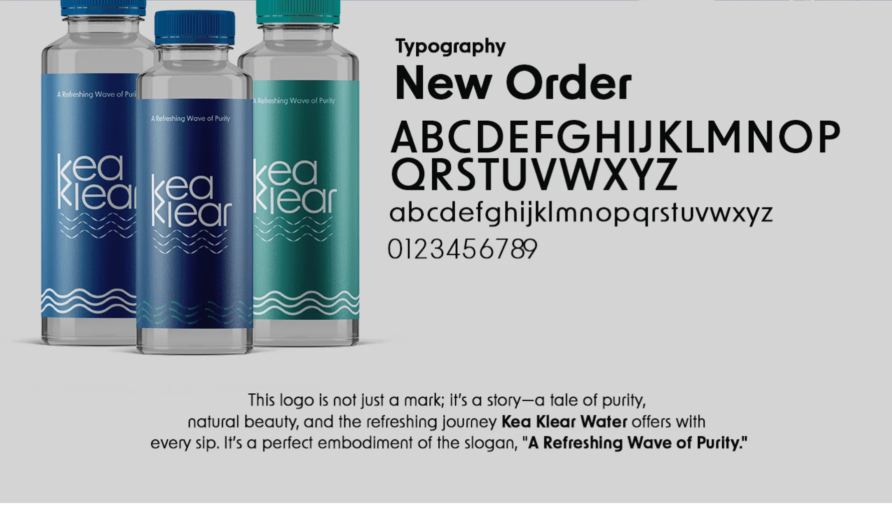
The colour system moves from deeper blue to brighter teal. Those shifts give the applications variety without stepping outside the same watery visual world. The presentation specifies New Order typography, whose geometric shapes complement the rounded wordmark and linear waves.
Refreshment in everyday settings.
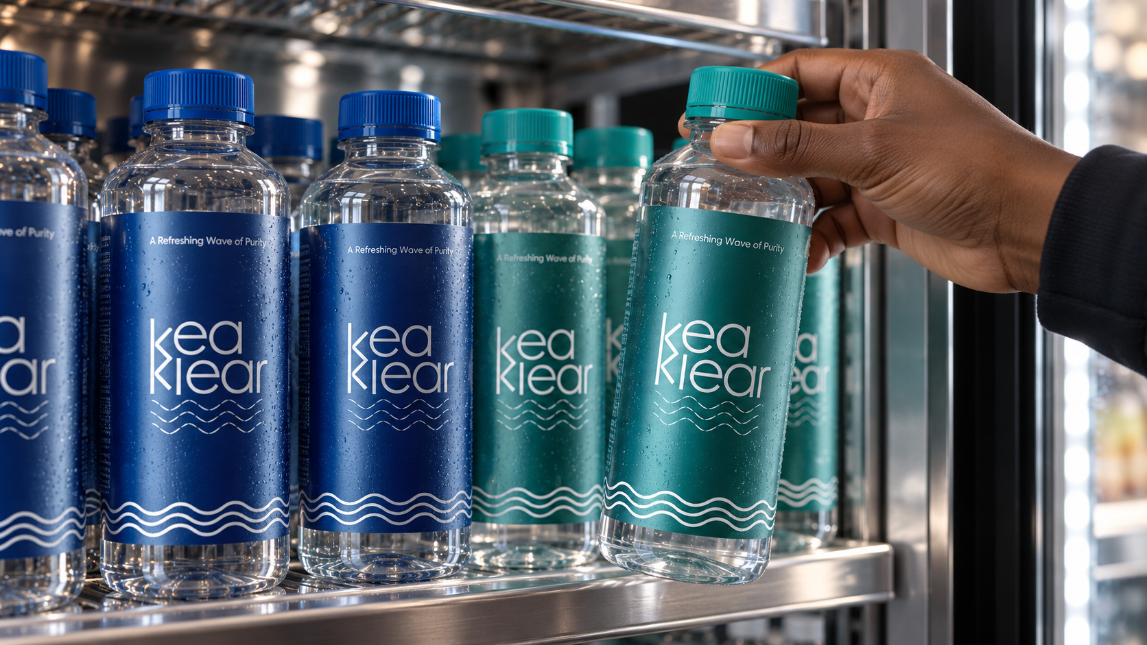
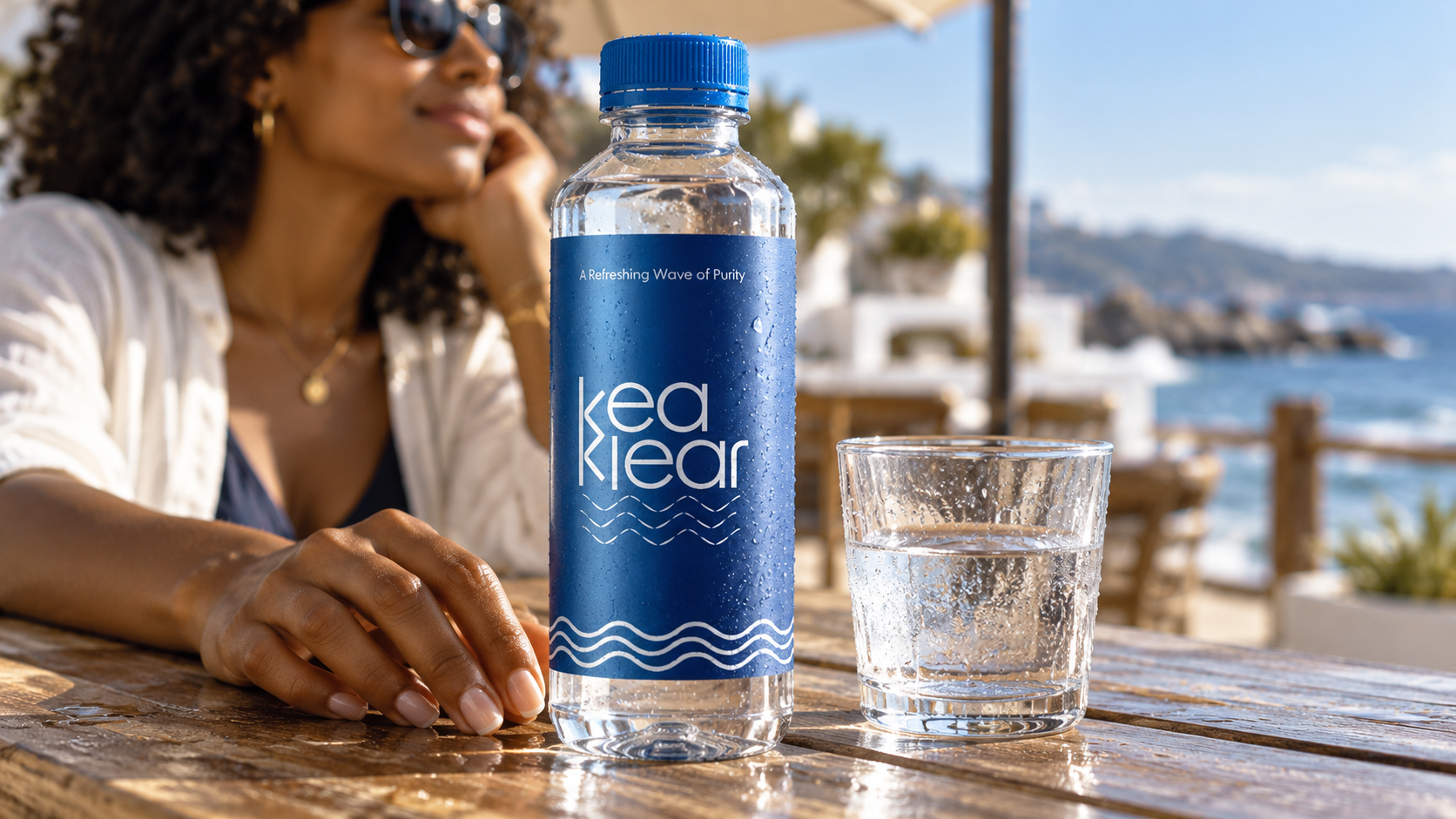
The product and lifestyle applications place the identity in familiar moments: a pause after exercise, a bottle selected from a chilled display and a relaxed waterfront table. The opening image brings the teal treatment into an active outdoor setting, keeping the bottle and its label at the centre of the story.
In the chilled display, blue and teal bottles sit together as a coordinated visual family. Matching caps, white stacked lettering and repeated wave lines create continuity across the two colour treatments. The waterfront composition gives the blue label its own moment, with the “A Refreshing Wave of Purity” message visible above the wordmark.
These presentations extend the packaging story beyond a standalone mockup, showing how the identity can remain recognisable in both a retail-style setting and everyday lifestyle imagery.
From a small bottle to a public statement.
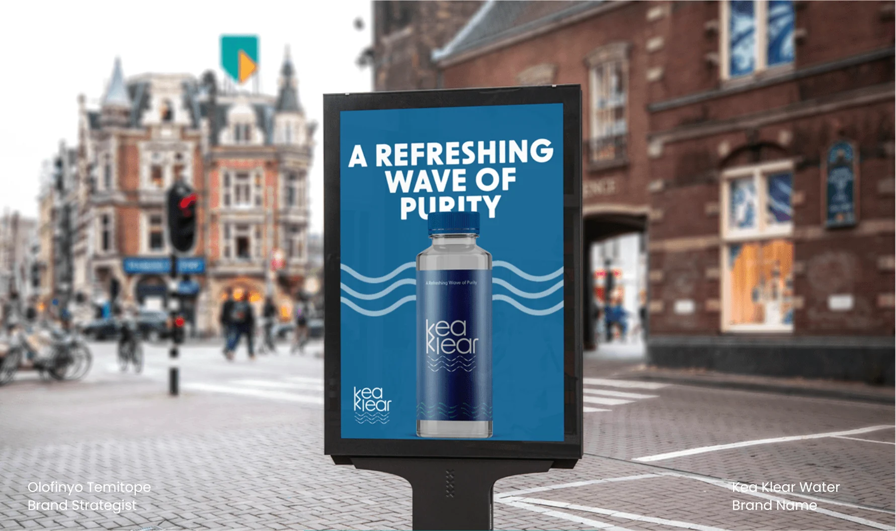
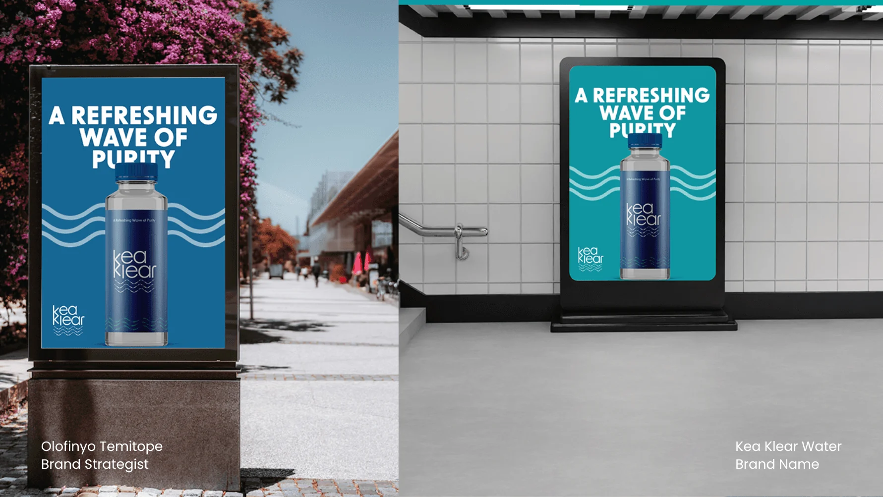
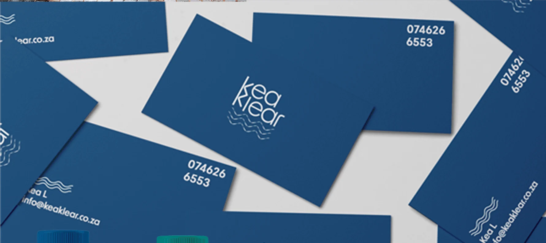
On outdoor applications, the wave device becomes a structural element rather than a small logo detail. It frames the product and supports the “A Refreshing Wave of Purity” message. Business cards carry the same identity into a smaller, more personal format.
The pieces, connected.
A connected identity presentation spanning a distinctive wordmark, a defined colour and type system, bottle mockups, stationery and outdoor applications. The published work demonstrates visual consistency; commercial performance was not provided.
Another perspective.
 View project
BeetFresh
Plant-Based Food & Beverage
 View project
DMA Kiddies
Children’s retail & family experiences