
ZaniPay Brand Identity & Digital Design
Exchange without borders. An identity built around clarity, confidence and connection.

- Client
- ZaniPay
- Sector
- Currency exchange & cross-border payments
- Studio
- Bennie Design Studio
- Scope
- Brand identity, logo design, colour system, typography direction, campaign layouts, website design direction and brand applications
- Presentation
- Identity & application concepts
ZaniPay is a financial-services brand focused on currency exchange, crypto buy-and-sell and cross-border payments for the African diaspora, entrepreneurs and international traders. Bennie Design Studio’s identity brings that proposition into a distinctive visual world: a compact symbol, an expressive colour palette and a consistent language across digital and physical touchpoints.
Original project on BehanceThe original brand introduction and the supplied identity artwork inform this case study. Signage, outdoor, merchandise and digital mockups illustrate design applications; they do not establish a live app, completed premises or campaign performance.
The challenge: making connection feel clear
ZaniPay’s introduction centres on trust, speed, accessibility and financial empowerment. The design challenge was to express those qualities without losing the human side of moving money across currencies and borders.
The identity needed to feel recognisable in very different settings—from a small digital icon to an outdoor campaign—while keeping the brand name and its message easy to understand.
A compact mark. A confident signature.
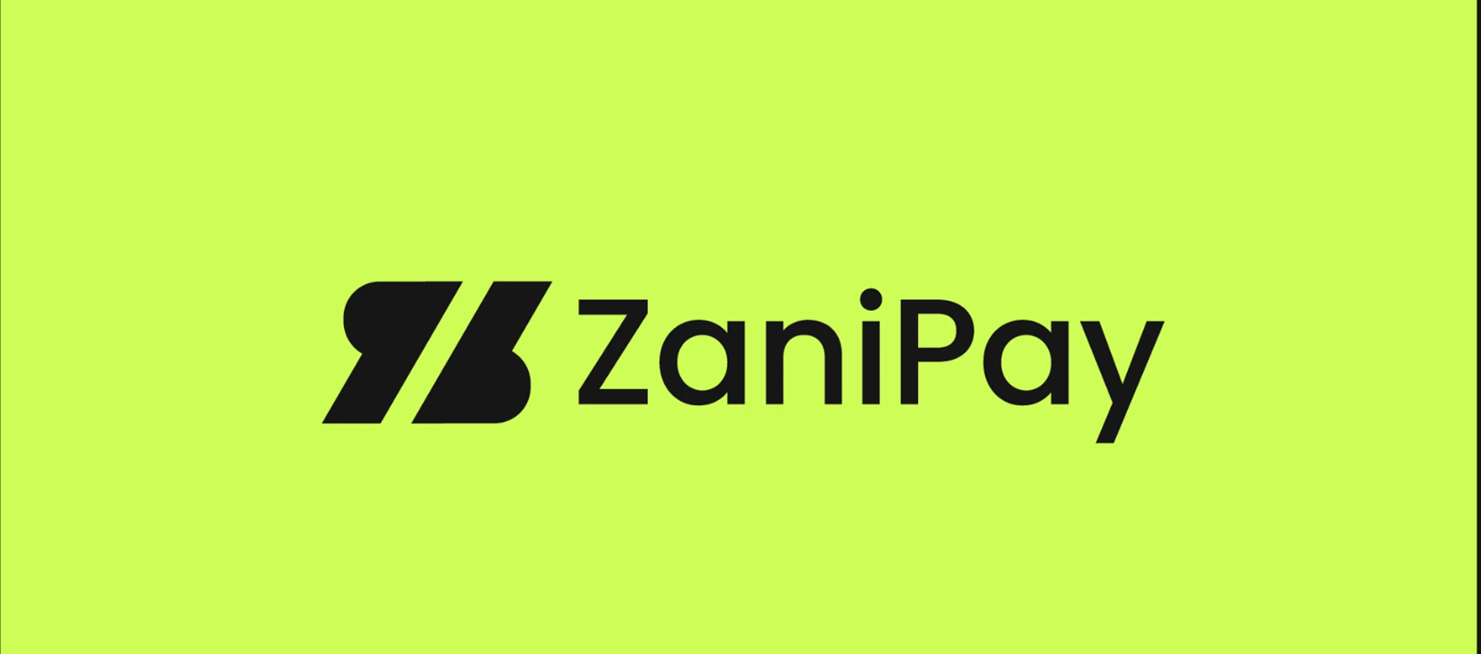
The symbol uses two bold, slanted forms separated by a diagonal channel. Rounded ends soften its angular structure, giving the mark a balance of momentum and approachability.
Alongside it, the mixed-case ZaniPay wordmark provides a clear, open signature. The full lockup identifies the brand on larger surfaces; the symbol alone creates a compact point of recognition for an app icon, notebook or label.
The supplied applications show the same silhouette in black, lime, violet and white, allowing the identity to adapt without changing its character.
A palette with energy and restraint
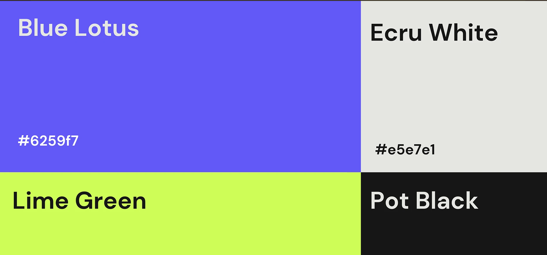
Blue Lotus (#6259F7) and Lime Green bring a vivid, distinctive pairing to the identity. Ecru White (#E5E7E1) and Pot Black provide quieter foundations, giving the brighter colours room to work.
Across the artwork, lime draws attention to the mark and key visual areas, while violet highlights selected words, payment labels and calls to action. Light and dark backgrounds keep each composition organised.
Bold sans-serif headlines lead the communication. Smaller, lighter text handles supporting information, creating a clear hierarchy without introducing unnecessary visual noise.
Exchange without borders
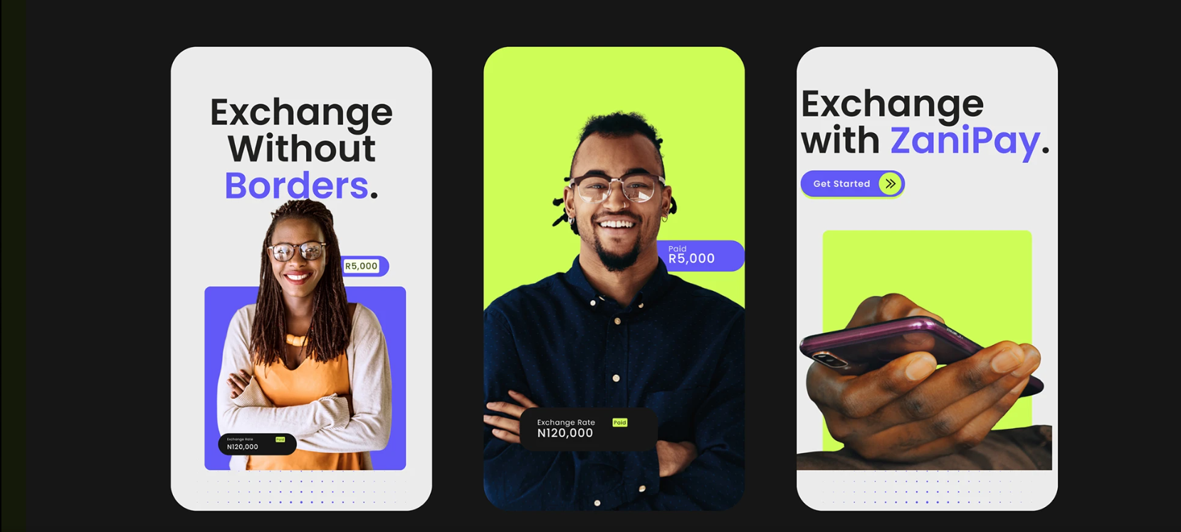
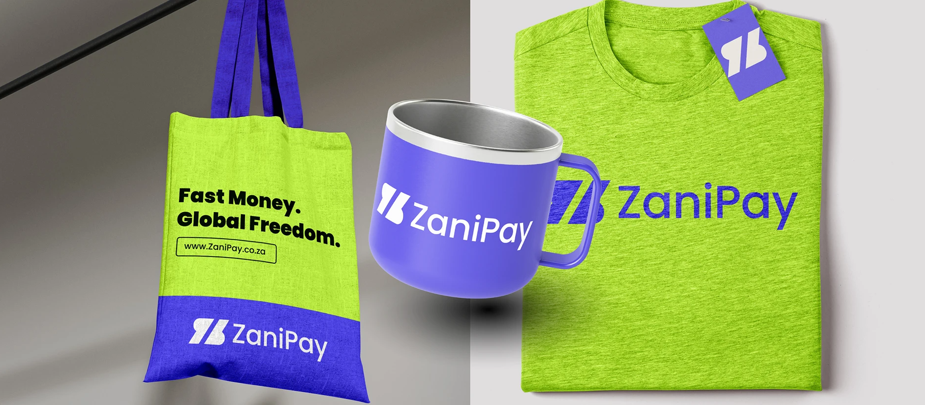
“Exchange Without Borders.” gives the brand a direct, outward-looking message. “Fast Money. Global Freedom.” carries the same idea into a shorter, more expressive line.
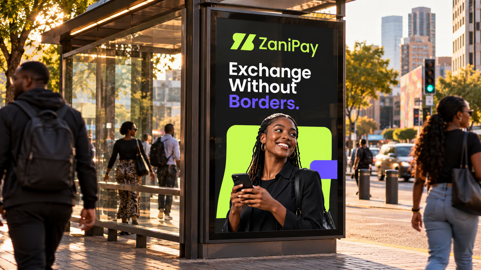
The campaign layouts pair these messages with portraits and everyday phone use. People remain the focus, with rounded colour panels and compact transaction labels connecting the imagery to the payment context.
Violet emphasis, lime accents and generous spacing make the layouts feel related, even when the arrangement changes. The result is a visual language that can move between portrait-led communication and a simple invitation to get started.
One identity across digital touchpoints
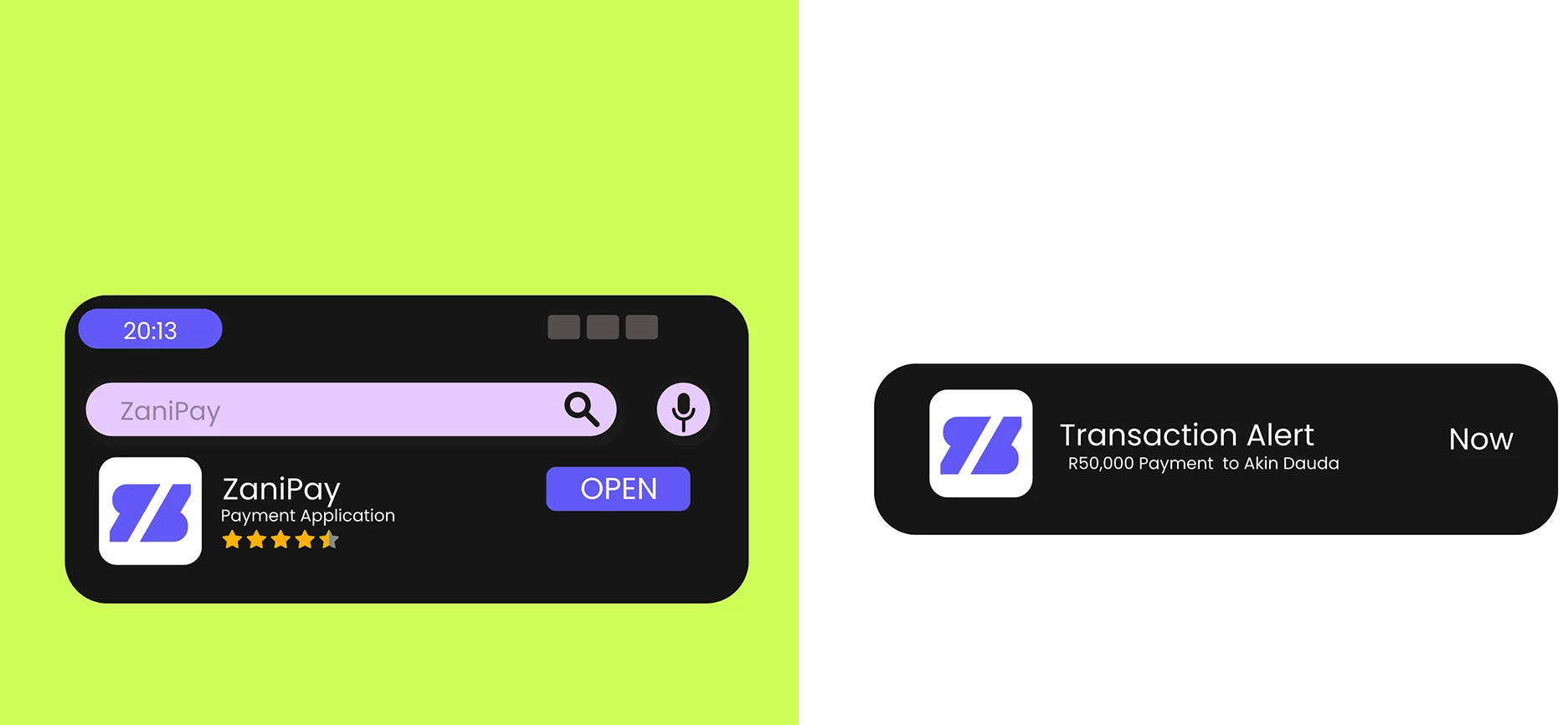
The digital application artwork demonstrates how the symbol can work at a smaller scale. A violet mark on a light rounded square creates an app-style icon, while the transaction-alert mockup pairs that icon with a concise payment message.
For the website design direction, the campaign’s bold headlines, rounded panels and lime-and-violet accents provide a connected visual foundation. The “Get Started” treatment shows how a call to action can carry the same character as the wider identity.
The supplied digital visuals show campaign and app-style applications, rather than a full website screen sequence or evidence of a released payment platform.
From business cards to everyday objects
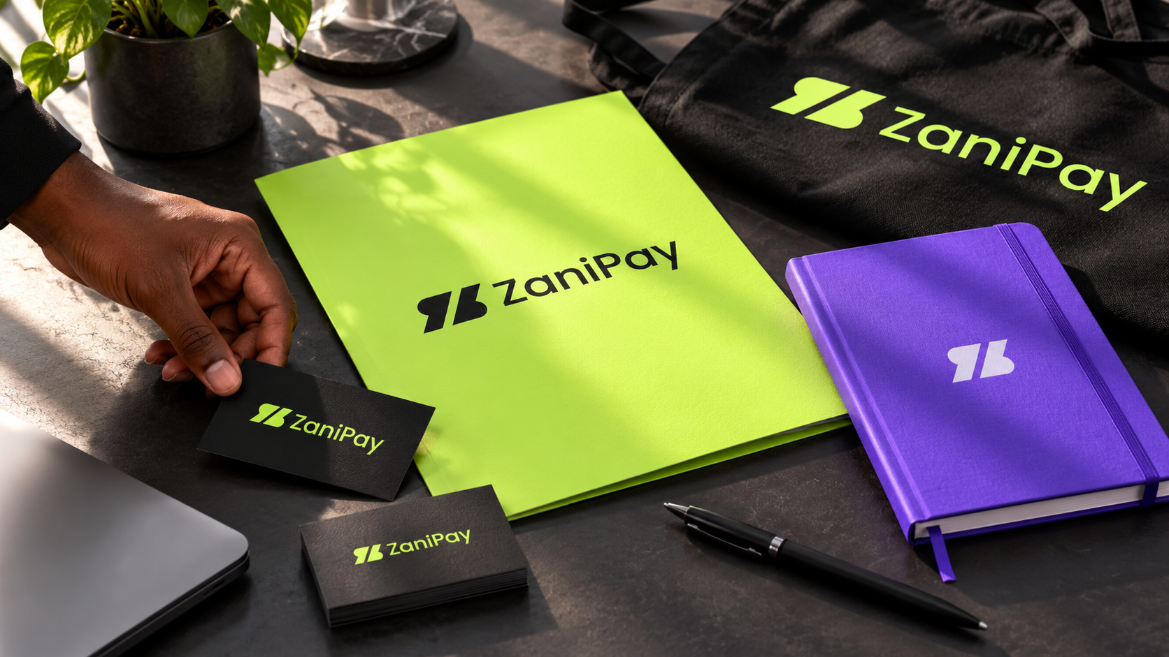
The stationery concept brings lime folders, black business cards and a violet notebook into one coordinated set. Full signatures and symbol-only treatments give the materials variety while keeping them recognisably ZaniPay.
Merchandise extends the same system to a tote, mug and T-shirt. Large blocks of lime and violet make the colour relationship visible, while white and black logo treatments adapt to each surface.
These applications show how the identity can feel consistent beyond a screen, without relying on the same layout everywhere.
Recognition at street and architectural scale
The reception concept introduces the brand through dimensional lime signage against a dark wall. The setting gives the full signature space to be seen clearly, with violet seating reinforcing the colour system.
At street level, the bus-shelter concept brings together the logo, the “Exchange Without Borders.” message and a portrait. Lime and violet frame the composition while the headline remains prominent.
Together, these concepts demonstrate how the same identity can move from a compact digital mark to a larger physical presence.
The pieces, connected.
A connected identity presentation spanning the ZaniPay symbol and wordmark, a defined four-colour palette, typography direction, campaign layouts and digital brand applications.
Stationery, merchandise, signage and outdoor concepts extend that system into everyday and public settings. The website direction follows the same visual language; development, launch and commercial results are not documented by these visuals.
One recognisable brand, across currencies, borders and touchpoints.
Another perspective.
 View project
Imvelo Accounting and Tax Services
Accounting & Tax Services
 View project
BeetFresh
Plant-Based Food & Beverage