
Hairport Beauty Salon Logo Design
A meeting of hair and destination. A restrained salon identity with a distinctive symbolic detail.

- Sector
- Beauty & salon
- Studio
- Bennie Design Studio
- Presentation
- Original portfolio artwork
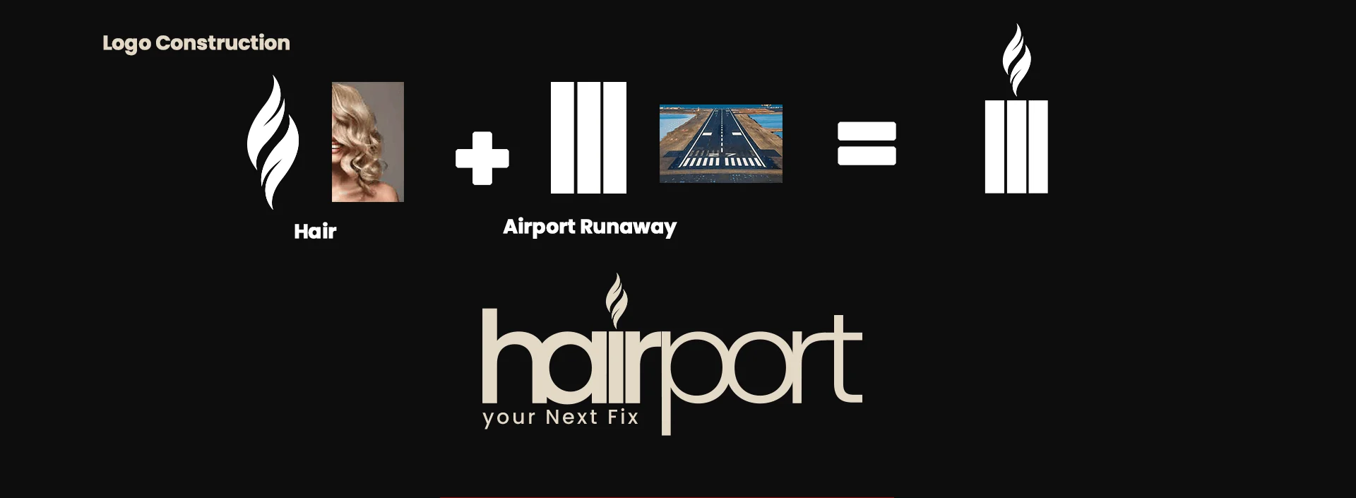
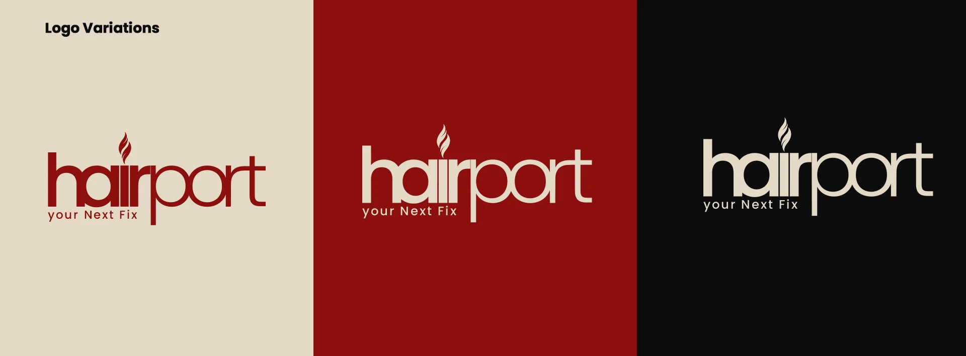
Hairport is a beauty-salon logo presentation. Its construction panel combines a hair reference with the geometry of an airport runway. The visible work includes a primary wordmark, supporting symbol, colour variations, image compositions, merchandise and a projecting-sign mockup.
Original project on BehanceSource: the accessible Behance artwork by Benjamin Olofinyo / Bennie. Original image compositions are preserved. Individual project descriptions and additional production credits were not accessible from the blocked project pages.
Two references. One simple mark.
The symbol combines a flowing strand with a set of vertical runway-like bars. That contrast makes the hair reference feel softer against the structured base. The wordmark places the detail above the lettering, bringing the symbolic idea directly into the name.
Let the identity frame the image.
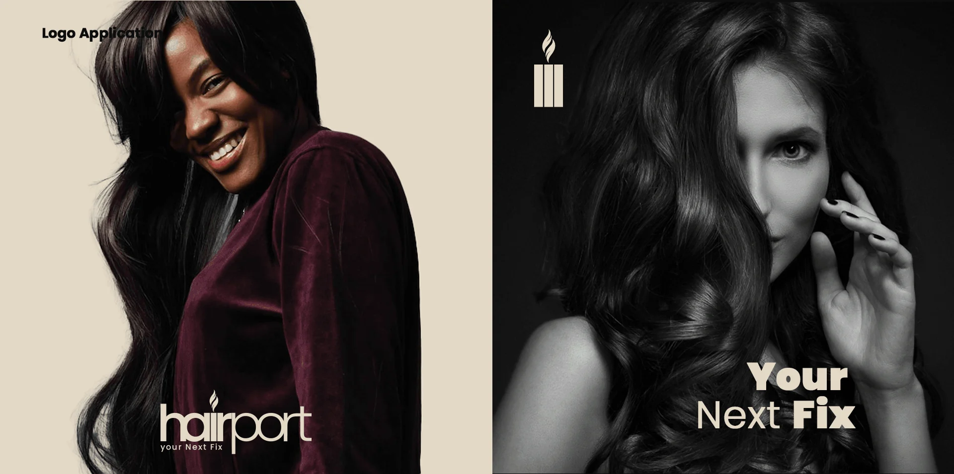
In the image-led compositions, the symbol and wordmark remain restrained while the salon imagery supplies most of the atmosphere. Cream, red and black offer different levels of contrast, with the light version holding its own against darker photographs.
A clear salon signature.
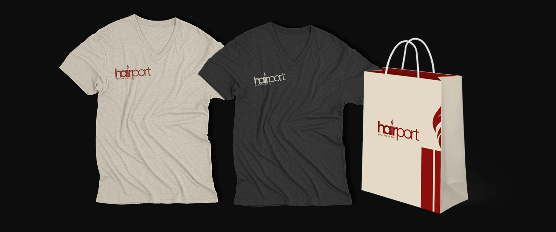
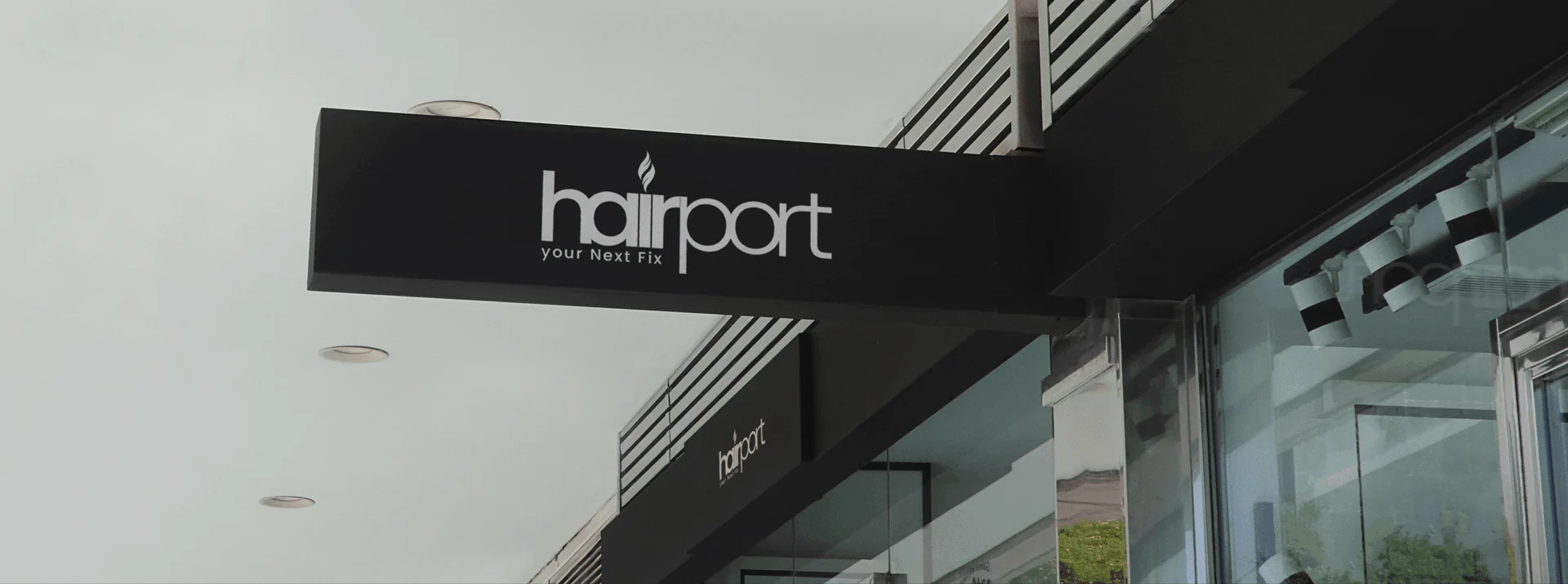
T-shirts, a bag and a projecting sign show how the logo can move into a salon’s everyday materials. These applications keep the name readable and the small hair detail visible without adding unnecessary graphic layers.
The pieces, connected.
A salon logo with a documented symbol construction, wordmark, contrasting variants and selected merchandise and signage applications. The presentation does not document a broader strategy engagement or website.
Another perspective.
 View project
BeetFresh
Plant-Based Food & Beverage
 View project
DMA Kiddies
Children’s retail & family experiences